These 18 ideas run from a gallon of paint and an afternoon to custom built-ins and structural beams, so the deciding factor is how much of your wall and floor you are willing to open up.
I would match the project to whether you need the room to feel larger, more private, or simply more finished, then pick from there.
The snake plant divider at seated height, the 2700K bulb rule, and the 30-inch passage minimum all come from the same logic: measure the space as people actually use it, not as it looks empty.
1. Open Concept Layout
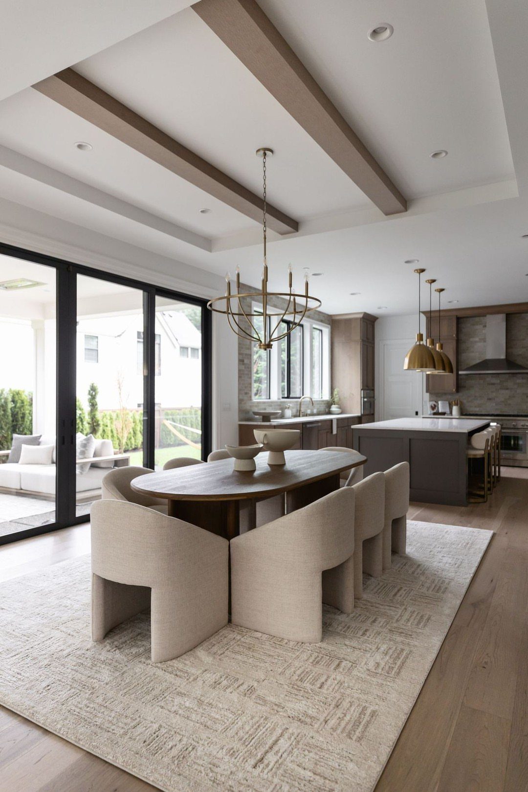
An open concept layout knocks down the wall between kitchen and dining to make one flowing room.
Set the dining table as its own zone, not an afterthought, with the kitchen island close enough to pass plates but far enough that cooks and sitters do not crowd each other.
Before you commit, check which walls carry load. A structural wall needs a beam, and that beam needs headroom; anything below standard ceiling height makes the space feel compressed rather than opened up.
Also confirm your flooring can run continuous or be matched; a sudden material change undoes the whole effect.
Small dining rooms present both a challenge and an opportunity. On the one hand, you’re working with limited space that’s just one ill-sized dining chair or bar cart away from feeling overwhelmed and cluttered.

Elevate Your Kitchen with Modern Designer Style: Featuring sleek linear LED elements paired with elegant glass globe shades, this statement light fixture instantly enhances kitchen islands, dining areas, and open-concept living spaces with sophisticated contemporary style.

Smart Dimming & Memory: Dimmable 10-100%, 3000K-6000K via remote/app. Set, then wait 30 sec without switching/dimming to save; it restores each power-on. Repeating within 30 sec overwrites it. Note: Built-in smart dimmer; standard wall switch only.

MODERN GEOMETRIC DESIGN】:Elevate your home decor with this sleek, matte black chandelier. The open-frame geometric structure creates a minimalist, contemporary aesthetic that blends industrial and farmhouse styles. Whether for a cozy dining room or a grand foyer, this 6-light fixture acts as an artistic focal point without overwhelming the space.
2. Overhead Fixtures, Sconces, and Accent Lights
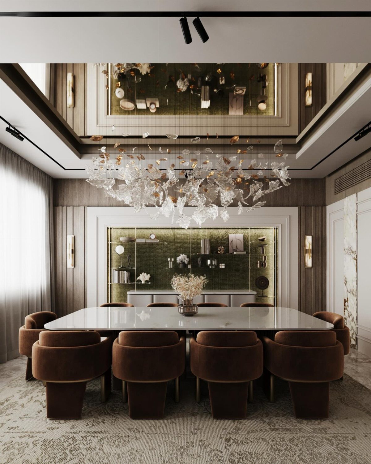
Layered lighting keeps a dining room usable from Tuesday takeout to Saturday dinner. The chandelier handles presence and scale; the sconces wash the walls so faces look better at the table; the cabinet lighting gives depth to the room’s edges.
I would start with the overhead at dimmer-compatible 2700K, then add sconces on a separate switch so you can drop the chandelier and keep the walls alive.
Accent lights inside a cabinet or on a shelf need their own circuit too; 3 switches sounds like overkill until you use them.

Energy Efficiency: Replace 60 Watt incandescent bulb by 4.5W LED filament light bulb, less energy than traditional incandescent lamp, Last about 25000 hours based on 3 hrs/day of use

EXCELLENT FULLY DIMMING PERFORMANCE: Compatible with 90% dimmers in the market (listed in the below product description), you could adjust the brightness of these candelabra led bulbs from 0-100% stably, no noise, no flicker, set your own mood and enjoy it

【Vintage Candle Bulbs】4.5W LED candelabra bulb is equivalent to a 60w incandescent lamp and is made of high quality glass. The retro candle shape gives your lamp a gorgeous and impressive look that is not only practical but has a strong decorative appeal. Perfect LED candelabra bulbs are widely used in your bedroom, living room, hallway or outdoor lighting fixtures with E12 base
3. Built-in Cabinets
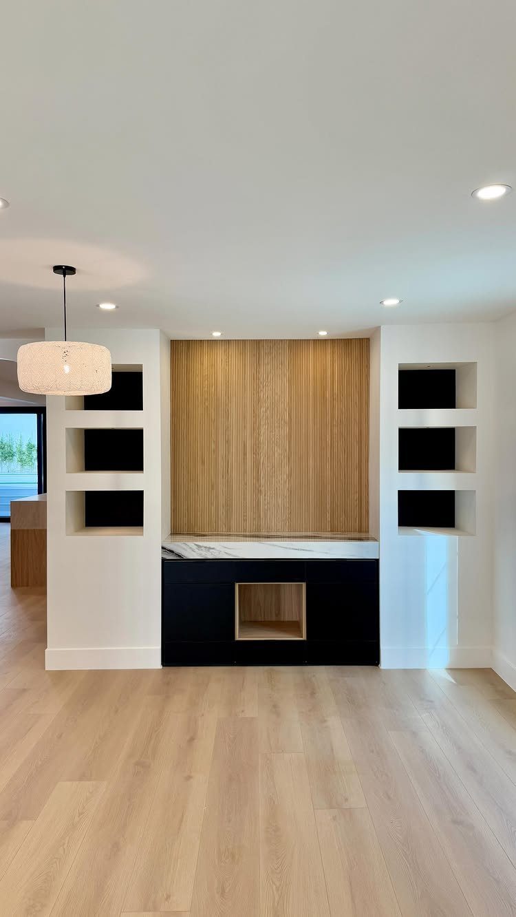
Built-in cabinets turn a blank wall into storage that reads as architecture. Lower cabinets in a dark tone, counter at working height, open niches above for display, all set into a slatted backdrop that ties it together.
This suits you if the wall has no window and the room needs a sideboard but you want it permanent.
Budget for custom or semi-custom; stock cabinets with a skilled trim carpenter can fake the look for less, but the slat detail and integrated counter need someone who measures twice.
I would put the niche height at eye level when standing, so what you display gets seen without bending or reaching.

【Elegant Brushed Brass Plug-In Wall Sconce 2-Pack】Durable brushed brass frame with white fabric shade casts soft warm glare-free light. Fixed arm ensures steady lighting, suits farmhouse, modern and minimalist styles. Fits standard E26 bulbs (not included).

Stylish and decorative: The Black Wall Light features a modern, industrial, vintage, and minimalistic design that complements various interior aesthetics. The combination of a natural wood base and a durable metal shade adds a touch of sophistication to your decor, making it both a functional and decorative piece.

The elegant wall mounted light will bring sophistication to your walls thanks to its brass metal arm and matte black round bell shade paired with a circular wall plate.
4. Bold Colors
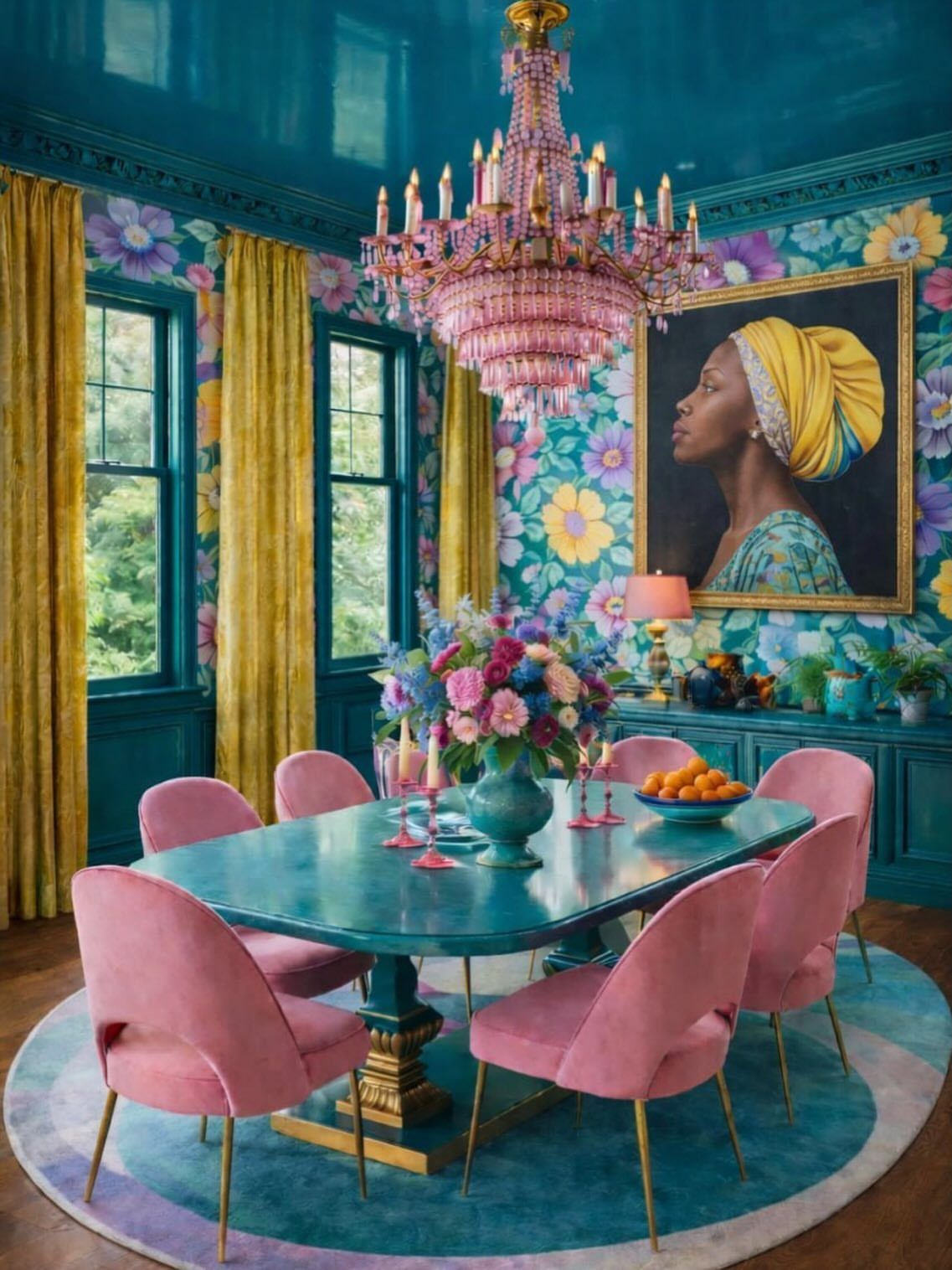
A single bold color on walls and ceiling makes the dining room its own world.
The photo goes further, mixing teal, pink, and yellow, but the principle holds: commit to one strong hue as the envelope, then layer in what you like.
This is not a test coat situation. I would buy the finish paint, not sample pots, and live with a full wall under your actual evening light before the rest goes up.
The ceiling matters as much as the walls; stopping at the crown breaks the effect and looks like you lost your nerve. Trim in white or black, never in between.

Perfect Fit for Your Space: Measuring 70.86" H x 30" L x 15.52" W, this pantry cabinet is designed to fit seamlessly into your kitchen, dining room, or bathroom. Kitchen cabinet's elegant arched top adds a modern farmhouse charm while providing additional vertical storage space, the textured natrual finish complements any decor style. Whether you need extra storage or a stylish statement piece, this pantry storage cabinet delivers both.

【Flexible Customizable Storage】Features two smooth gliding drawers and two cabinet doors with adjustable interior shelf (2 height positions). Organize spices, dinnerware, or essentials in the generous 32"H interior, transforming into a coffee bar cabinet with storage, kitchen island with storage, or efficient kitchen pantry cabinet.

Modern Storage Cabinet: Elevate your living room's style with our uniquely designed buffet cabinet. Its wave-shaped door surface adds a touch of distinction, setting it apart from traditional sideboards. With a spacious 7inch clearance between the cabinet and legs, you can conveniently store small items like sweeping robots at the bottom. Upgrade your storage game with this modern marvel!
5. Neutral Color Palette
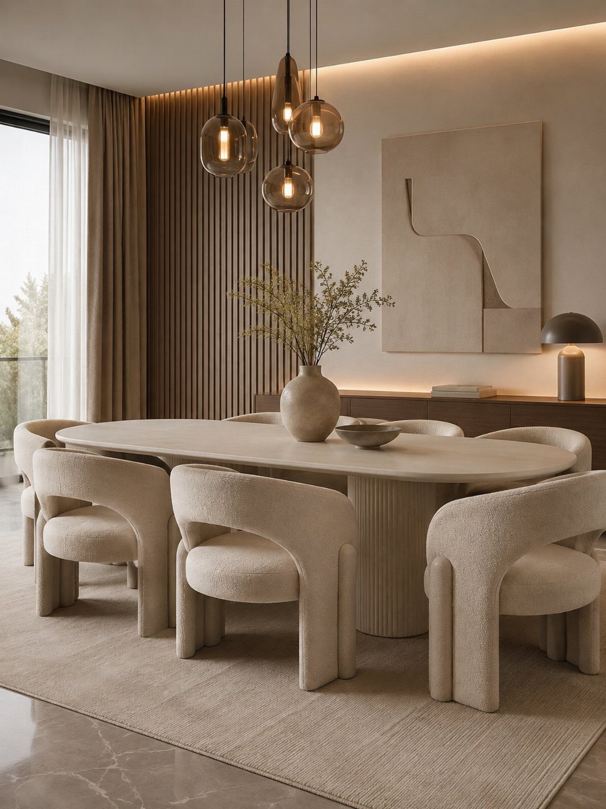
Soft whites, beiges, and grays let the furniture and the people at the table carry the interest. Fluted stone table, slat wall, upholstered chairs in a tone just off from the rug, nothing shouting.
I would vary texture more than color. The slat wall, the fabric weave, the stone grain, the wood tone of the legs; without that, neutral goes flat fast.
Paint sheen is part of it too; I like eggshell on walls, matte on ceiling, satin on trim so the light moves across surfaces even when the color barely shifts.

BUTTERY SMOOTH, ULTRA DURABLE PAINT: Adds a beautiful ultra-matte finish to furniture, doors, cabinets, décor and more

Content & Artistry Analysis: This piece showcases a vibrant wildflower meadow (poppies, daisies, and grasses) set against a deep teal background, rendered with thick, hand-applied brushstrokes and textured details. Hand-embellished elements like flower petals, stem layers, and background depth give it the feel of an original oil painting. It delivers a core value of dramatic natural elegance, ideal for lovers of moody floral art, maximalist decor, and rich color palettes

The information below is per-pack only
6. Bold Patterns in Wallpaper
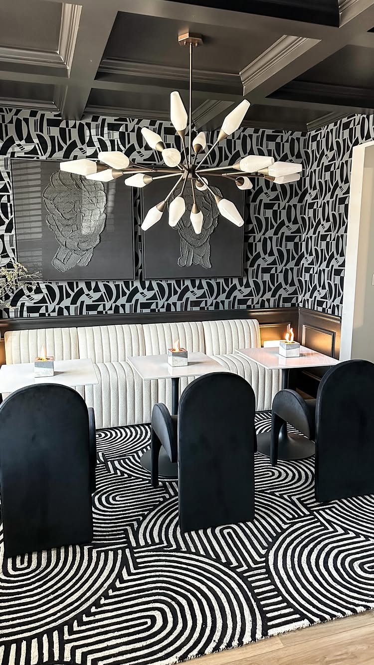
Bold wallpaper and a matching rug turn the dining room into a deliberate moment. The photo uses black and white geometry, which keeps the pattern from fighting the food or the company.
I would paper every wall, not one accent; the rug repeats the pattern so the room holds together, and a single papered wall with plain others would look like a leftover.
Banquette seating saves the pattern from too many chair legs breaking it up.
Smooth walls only; texture behind bold pattern reads as visual noise. Paste-the-wall papers go up faster, but I would still hire out if the repeat is large and the match needs to run around a corner.

Black Farmhouse Chandelier: Embracing a rustic and industrial style, this farmhouse chandelier features 6 elegantly simple lamp arms. The structure is solid, and the surface is finished with matte black, showcasing a classic and simple aesthetic. This black chandelier light fixture can be used in various spaces such as the kitchen island, bedroom, foyer, dining table, living room, entryway, farmhouse, and office.

Adjustable Height & Easy Installation: This farmhouse island light comes with adjustable chains, suitable for both flat and sloped ceilings, allowing you to tailor the height as desired. With the help of the manual and installation guide video here,it would be a breeze to install it. Note: please check the item condition and accessories instantly upon receiving parcel

LIGHTS THAT HELP YOU CLEAN THE TABLE - No corners left in the shade! Solvita billiard pool table light is designed to shine a gleaming light on your pool table, while also illuminating the rest of your rec room. LED Pool table light that is just right
7. Dining Room Table
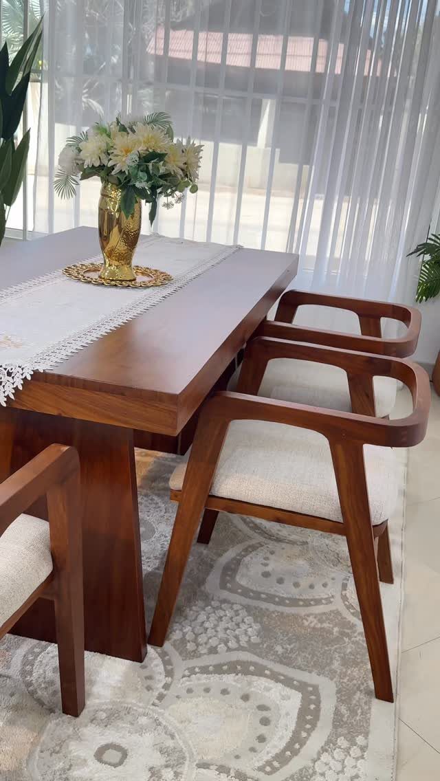
The dining table is where the room’s purpose becomes physical: size, shape, and material decide how many people sit comfortably and how the room feels when they do.
I would measure the space with chairs pulled out, not tucked in; the clearance behind each seated person needs to be enough for passing through without a shuffle.
A runner and a low centerpiece keep sightlines open across the surface. Wood warms the room and forgives daily use better than glass or high-gloss lacquer.

Energy Efficiency: Replace 60 Watt incandescent bulb by 4.5W LED filament light bulb, less energy than traditional incandescent lamp, Last about 25000 hours based on 3 hrs/day of use

2700K Soft Warm White Lighting: The right candelabra bulb can transform your home’s ambiance. Our chandelier bulbs emit a bright, natural 2700K soft white light with a 360-degree beam angle, offering comfortable illumination with a Color Rendering Index (CRI) of 90+. This high CRI ensures that all objects display their true colors, making them appear more vibrant. The bulbs are flicker-free and do not emit UV or IR radiation, effectively protecting your and your family's eyes

Excellent Quality without Flicker: Brightever light bulbs have passed rigorous testing standards - are free of harmful substances such as mercury and lead, and will not produce UV and IR radiation. That also means, our bright white light bulbs are Eco friendly bulbs that can help to save the planet you live on. No flicker, strobe or glare, our 40 Watt Equivalent light bulbs emit a stable light to better protect your eyes.
8. Oversized Pendant
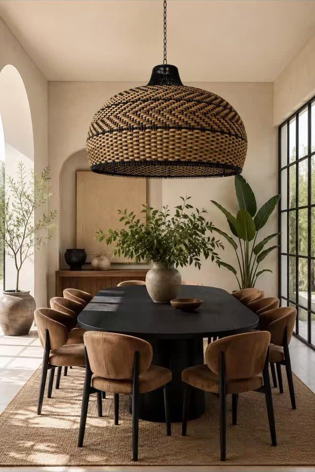
An oversized woven pendant turns the ceiling into a presence that anchors the whole room. Japanese lantern proportions mean the shade is wider than you expect, so the table below needs heft to match.
I would hang it low enough to stay personal to the table, not so high it drifts into general room light or so low it blocks faces.
Dark wood or black bases absorb the shadow the weave throws, which is the point. The jute rug and potted plants keep the material story consistent: natural fiber, unpolished, nothing competing for attention with the scale of the light.

【Compact Size with Elegant Clear Glass】Perfect for tight spaces: this wall sconce features a 3.94" (10cm) arm and a 4.33" x 5.91" (11cm x 15cm) tulip-shaped glass shade—ideal for hallways, bedrooms, or cozy corners. The high-quality clear glass refracts light beautifully, eliminating glare while casting a warm, inviting atmosphere. Includes a G45 6W LED bulb (2700K) for instant cozy illumination.

E26 Base Design : The metal shade fixtures designed with E26 medium base with power of 40W suggest. Works with LED; Compact Fluorescent (CFL); Halogen; Incandescent (Note: bulbs are not included)

One set with 2 pcs. Each one is a single sconce with 1 light socket. Dimension: Overall: 7.0" w x 12" h. Back Plate: 5.9w. Shade: 7.0w x 6.5" h.
9. Different Styles of Chairs
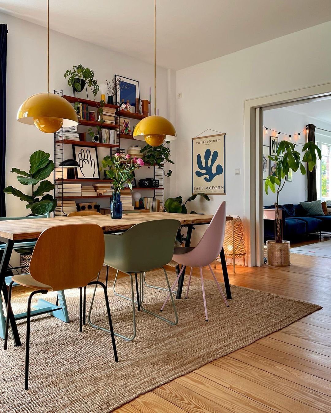
Mismatched chairs around one table ask for one shared element or the room looks accidental. The photo solves it with wood tones that relate, not match, and a common seat height so the table line stays level.
I would pick a unifying limit: all wood, or all painted, or all with the same leg silhouette, then let color wander within that fence.
Two of one chair at the head and foot, different ones along the sides, gives structure without uniformity.

Quality Material: This Kitchen storage cabinet is crafted from premium manufactured wood and hardware, the buffet cabinet performs excellent stability and incredible durability to serve for years. The tabletop supports up to 300lbs. Overall Dimensions: 15.7"D x 28.3"W x 31.9"H.

MODERN FARMHOUSE DESIGN: This wooden storage cabinet features gold handles that complement its rustic charm and modern elegance, blending country allure with contemporary sophistication. Perfect as a buffet cabinet, sideboard, or decorative storage cabinet for any room

SLATTED DESIGN WITH NATURAL WOOD GRAIN: Features slatted pattern on the doors, highlighting the wood grains while adding texture and depth to the modern style
10. Wood, Metal, and Fabric
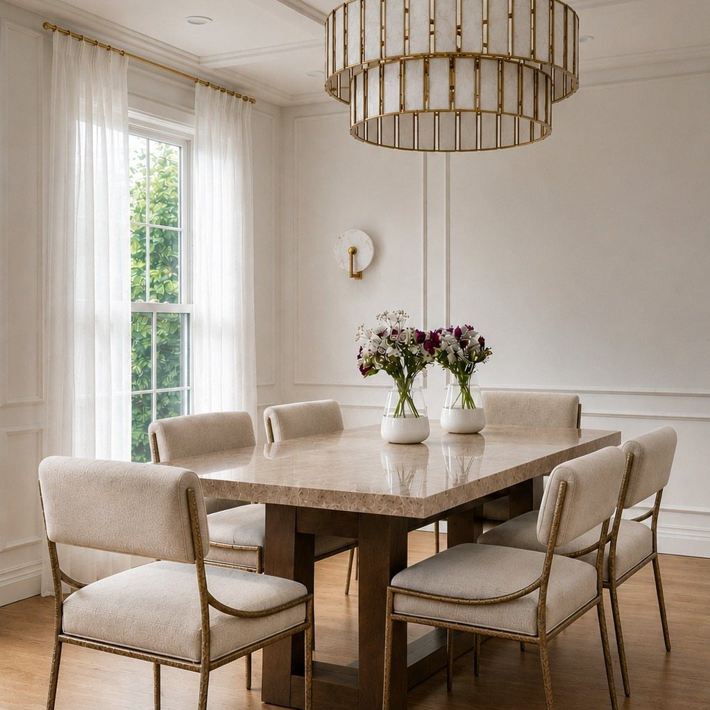
Stone, brass, and upholstery together need one tone to dominate or the room turns competitive.
The photo lets the brass chandelier set the metal thread, then repeats it in the chair frames so the table base can stay dark and quiet.
I would keep the fabric neutral when metal and stone both want attention; pattern on the chairs would fight the veining in the marble. Sheer curtains matter here, they soften the hard surfaces without adding another material claim.
The cost is in the stone top and the metalwork; a laminate stone-look top with powder-coated steel frames gets the same rhythm for less, though the weight and the patina will differ.

Content & Artistry Analysis: This piece showcases a vibrant wildflower meadow (poppies, daisies, and grasses) set against a deep teal background, rendered with thick, hand-applied brushstrokes and textured details. Hand-embellished elements like flower petals, stem layers, and background depth give it the feel of an original oil painting. It delivers a core value of dramatic natural elegance, ideal for lovers of moody floral art, maximalist decor, and rich color palettes

ALL SEASON PAINT & PRIMER-IN-ONE: Cascadia XL is a 100% Acrylic Latex Paint & Primer-in-One with advanced technology for rain protection and a superior finish

♤ Rose wall art Painting Size:20 x 20 inch ( 50 x 50cm ) / Piece, total 4 Panels,canvas wall art.
11. Area Rug Under the Dining Table
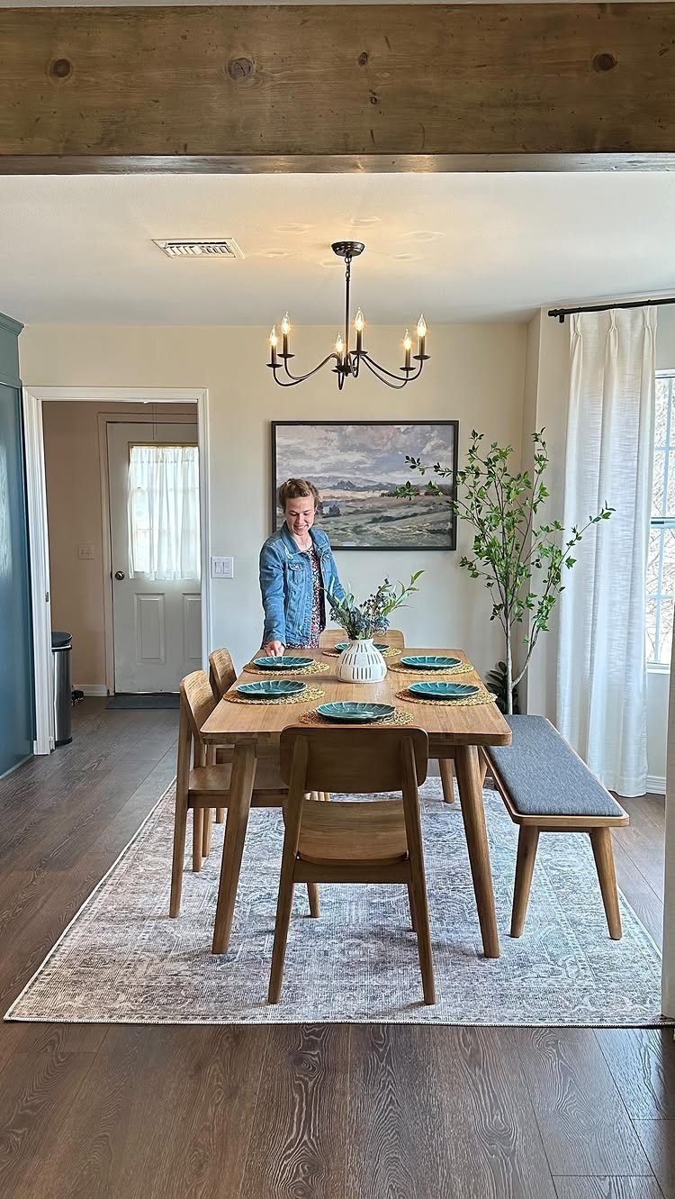
An area rug under the table defines the dining zone in a way paint and furniture alone cannot.
A large patterned rug with a wooden set and bench on top means the rug carries the visual interest so the furniture can stay simple.
Size is the decision that matters. I would add enough length to each side of the table that pulled-back chairs stay on the rug, not half on and half off.
Pattern hides crumbs and the wear path from kitchen to table better than solid color. A bench on one side saves a few inches of floor width and seats more people than individual chairs in that slot.
12. Classic Pieces
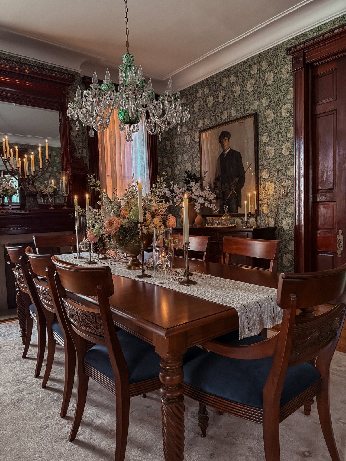
Classic pieces in a dining room mean the investment goes into items that outlast trend cycles. Dark polished wood, crystal, and patterned wallpaper make a specific traditional vocabulary, not the only one.
I would buy the table and chairs for permanence, the chandelier too if the ceiling box supports the weight; wallpaper and centerpieces rotate with less cost.
The blue chairs against the dark wood work because the tone is deep enough to hold its own, not a pastel that would read as tentative. Crystal needs dimming; full brightness turns sparkle into glare.
13. Built-in Bench for Seating
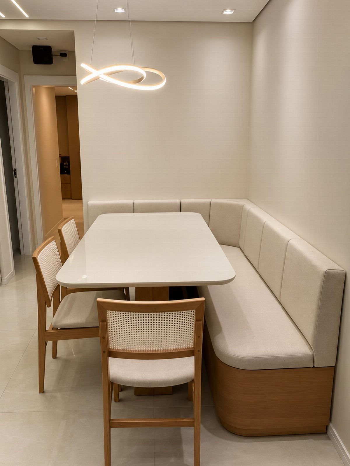
A built-in bench turns a corner or window wall into seating that does not shift when someone slides in.
An L-shaped built-in with an upholstered back and seat can hide storage inside a hollow wood base or under a lift-up seat, which I would choose over fixed seating every time.
I would check the wall length before committing; too short and the bench looks stranded, too long and it dominates the room.
The table needs to sit close enough that diners do not lean across a gap, far enough that legs clear when standing. Cane chairs keep the material story light; solid wood would compete with the bench bulk.
14. Use a Gallery Wall
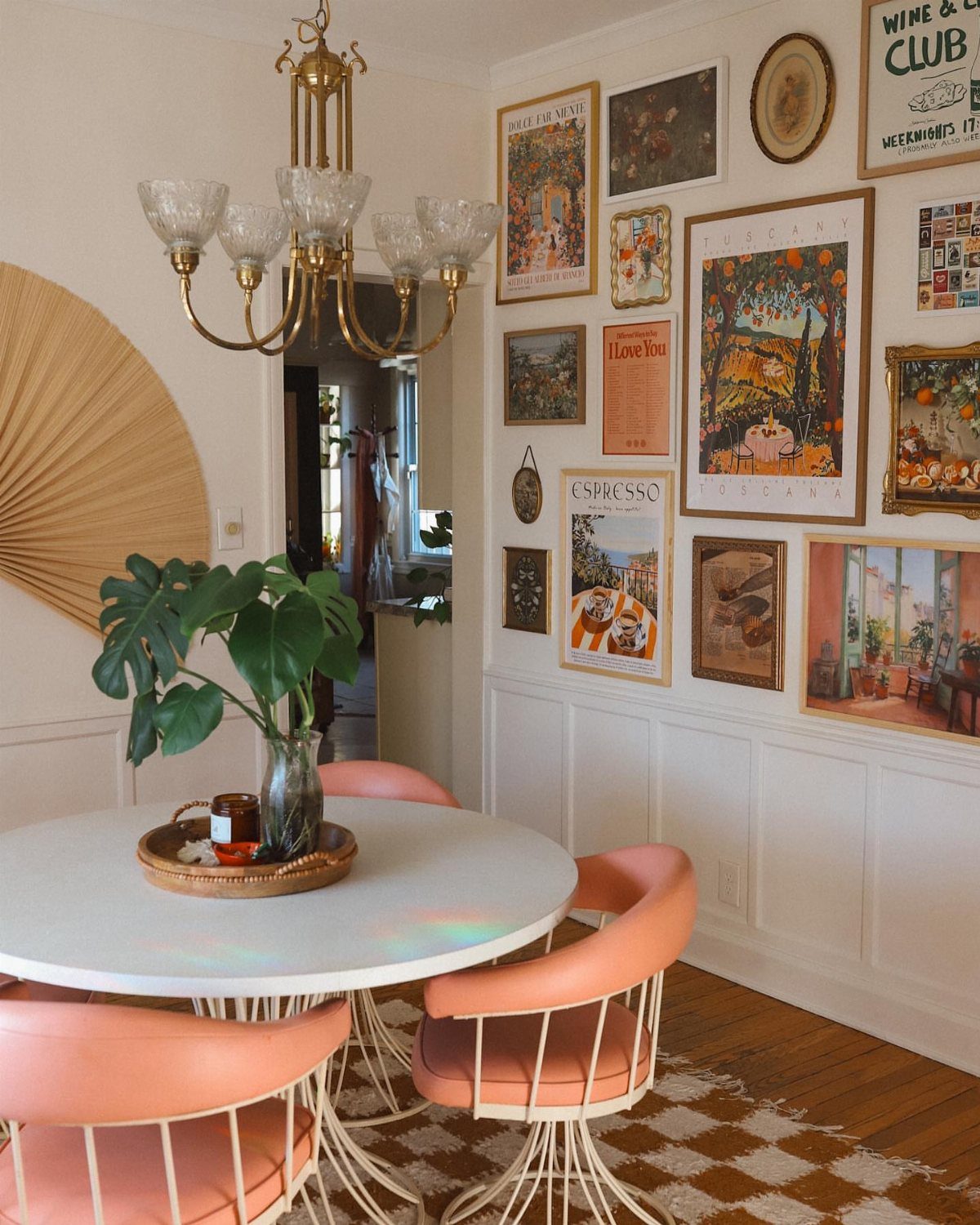
A gallery wall fills the visual field behind a table so the room reads finished even when the surface is bare.
The photo mixes framed prints with text, different sizes, one color thread running through, which keeps the arrangement from feeling like a yard sale.
I would lay it out on the floor first, measure the total height and width, then transfer that rectangle to the wall with painter’s tape.
Start from the center, not the top; the eye finds the middle of a collection, and working outward keeps the weight balanced.
Brass chandelier and pink chairs in the same room mean the frames can wander in finish; with less color elsewhere, I would stick to one metal.
15. Light-Colored Flooring
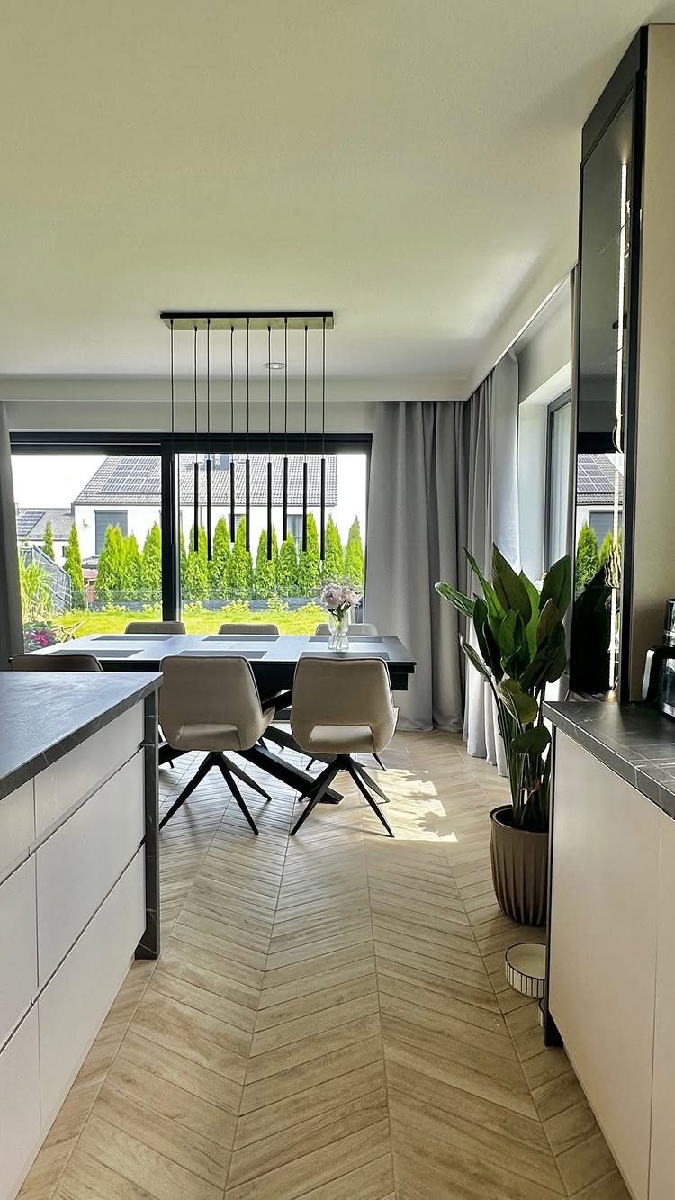
Light flooring reflects what daylight the room gets and keeps a dark table from sinking into shadow. Herringbone or chevron in pale wood adds pattern underfoot without a rug, which saves the cost and the cleaning.
I would check the wood species and finish against kitchen floors if the rooms connect; a sudden shift at the doorway breaks the flow. Dark furniture on light floors shows every crumb, so the finish needs to tolerate frequent sweeping.
Black pendants need enough ceiling height that they do not drop into sightlines; I would skip them entirely in a room with a low ceiling.
16. Incorporate Greenery
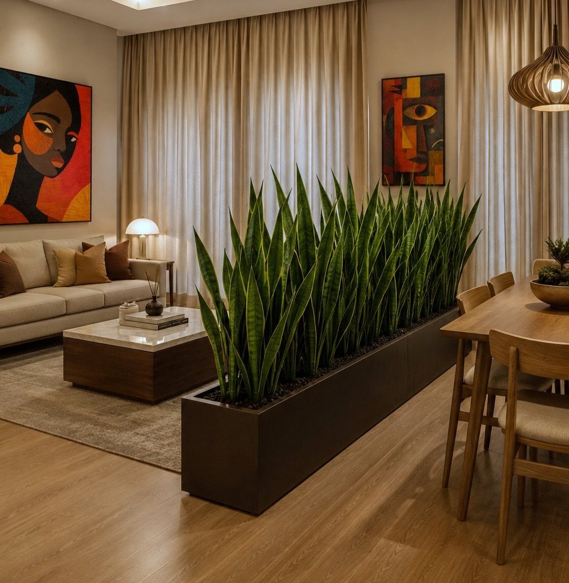
A long planter of snake plants divides living and dining without a wall that blocks light or conversation. The photo sets the planter at seated height, so it reads as a low screen rather than a barrier.
Snake plants tolerate the dry air and inconsistent watering that dining rooms get; I would choose them over ferns or anything that wants humidity.
The planter needs a waterproof liner and a tray; water stains on wood or tile are permanent. I would place it where it does not narrow the path between rooms; 30 inches of clear passage is the minimum for comfort.
17. Stylish Bar Cart
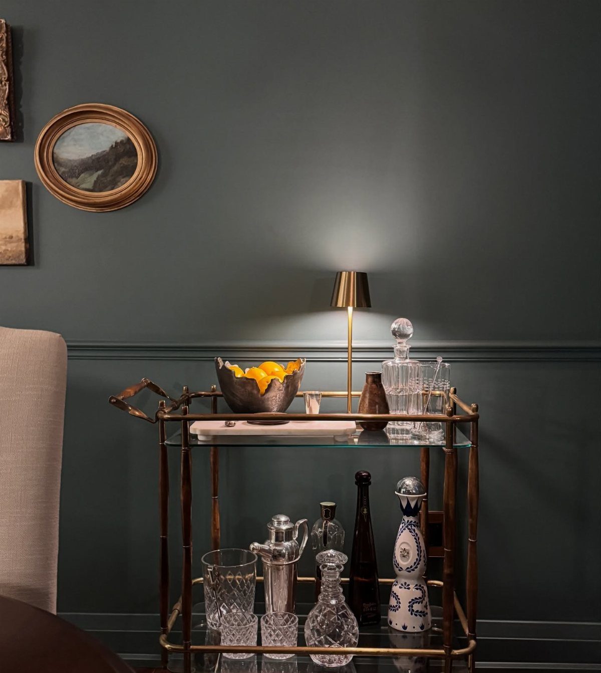
A bar cart holds the clutter of entertaining in one movable station that rolls out for use and back against the wall after.
A brass frame with glass shelves and a small lamp for warmth needs an outlet nearby or battery power, so I would plan the location before buying.
I would style it with what I actually use, not every bottle I own; a tight edit of spirits, one mixer, and just enough glassware keeps it functional and good to look at.
The top shelf wants height variation, the bottom wants weight so the cart does not tip when moved. Against a dark wall, brass reads; against light, I would choose black or wood.
18. Glass Doors
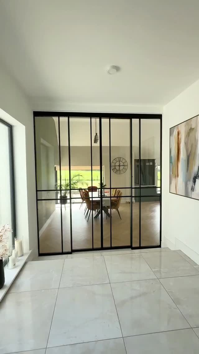
Glass doors keep 2 rooms separate for sound and climate while the eye travels through, which matters when the dining room has the better light.
The photo uses black metal frames in a grid, sliding rather than swinging, which saves the floor space a door arc needs.
I would check the track hardware; exposed top-hung systems look cleaner but need a header that carries weight.
The frames will read as lines across whatever view they frame, so I would keep the wall beyond them quiet. For privacy, a sheer layer on the dining side softens the exposure without losing the borrowed light.
Budget-Friendly Updates
A gallon of paint covers a standard dining room in a few hours; one weekend changes the room’s whole attitude. I would do walls and ceiling in the same color to save on cutting-in time and second-guess work.
New pulls on cabinets or the buffet read as a full upgrade for the cost of a coffee run.
Matte black or brushed brass on existing cabinet and door hardware ties the room together in an afternoon. I would replace hinges too, not just pulls; mismatched metals show.
A flatweave or low-pile rug from a discount home store defines the zone and takes the abuse chairs dish out. I would measure with chairs pulled back, buy large, and let pattern hide what drops.
Artwork does not need a gallery wall budget. One large piece or a tight cluster of frames from a thrift store, unified by mat color, fills the visual gap behind a table.
Creating Ambiance
Warm color starts at 2700K on the bulb box, not the paint chip.
Anything cooler and faces look tired; anything warmer and food looks off. I would put every dining room bulb at 2700K and be done with it.
Dimmer switches need a compatible LED; the wrong pairing flickers or drops out at low levels. I would test the exact bulb on the exact dimmer before buying twenty of them.
Wall color sets the baseline the light works against.
Deep tones absorb brightness, so you need more lumens or more fixtures to reach the same usable level. I would plan for that in the circuit count, not discover it after the walls are up.
Texture does the work color used to: slat walls, stone grain, fabric weave all catch side-light from sconces and make the room feel lit even when the numbers say it is dim.
I would place sconces to graze those surfaces, not wash them flat.
Black, gray, and deep wood tones read as warmth when the light is warm; the same colors under cool light go flat and institutional. The tone of the bulb decides which side of that line you land on.
Frequently Asked Questions
How do I modernize my dining room?
Start with a neutral palette of soft whites, beiges, and grays, then bring in clean-lined furniture and contemporary lighting like a sleek chandelier or oversized pendant.
Layer the lighting at 2700K with dimmers so the space works for both daily meals and evening gatherings.
What are the dining room trends for 2026?
Open layouts that flow into the kitchen, single bold colors carried from walls to ceiling, and mixed materials like wood, metal, and stone together in one room.
Built-in storage that reads as architecture, oversized woven pendants, and gallery walls that fill the visual field behind the table: those three are carrying the most weight right now.