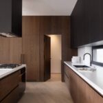

Beige dining rooms work across budgets and eras, but the right version depends on one thing: what you already own and what you cannot change.
A marble table anchors a modern space, yet porcelain at one-third the weight wins for renters hauling furniture up stairs.
The same walls read farmhouse or industrial based on whether you add reclaimed oak or steel, and the undertone you choose either unifies the room or turns it accidental.
1. Contemporary Marble Tables

Marble veining breaks up beige’s flatness in a way no paint layer can. The stone’s cool gray threads pull the eye across a tabletop and keep a neutral room from going static.
I would put my money into one marble dining table as the single statement piece and build the rest of the room around it, since beige walls and upholstery recede enough to let the stone do the work.
For renters, that one heavy piece is worth the trouble of moving. It travels to the next apartment and instantly establishes the dining area.
The weight is real, though. Marble-look porcelain runs about one-third the weight and ships flat, which matters when you are hauling it up stairs yourself.
The printed veining has improved enough that I would use it without apology in a rental I planned to keep for a few years.
Real marble still wins on surface depth, but porcelain wins on the weekend you spend setting it up alone.

[Expandable for Every Occasion] Easily extend the tabletop from 63 inches to 79 inches to accommodate everyday family meals or larger gatherings. Comfortably seats 6 to 10 people, making it perfect for holidays, celebrations, and dinner parties.

EXPANDABLE DINING TABLE – Easily extends from 63" to 79" to accommodate 4–8 guests, perfect for family dinners, parties, or holiday gatherings. Faux marble tabletop adds warmth and sophistication to any dining space.Table dimensions: 62.99" (L) x 31.5" (W) x 29.53" (H) when unextended, and 78.74" (L) x 31.5" (W) x 29.53" (H) when fully extended

【Perfect Size】Measuring 6.3 inches wide and 7.4 inches high, ideal for both fresh and artificial flowers.
2. Classic Wood Finishes

Oak, maple, and birch carry the warmth that makes a beige dining room feel lived-in rather than blank. Their grains read clearly against pale walls without shouting for attention, which is the balance traditional spaces need.
I would put medium or lighter wood tones at the center of this look; they let the beige breathe and keep the room from sliding into heaviness.
Dark walnut against beige is where I would draw the line. Both colors sink toward the same muted register, so the wall and the table end up flattening each other instead of layering.
If you already own a darker set, the fix is usually lighter chair upholstery or a pale runner to break the weight.
A birch table with simple turned legs and a warm oak sideboard gives you the classic pairing without the formality of a full antique suite. The wood does the work; the beige steps back and lets it.

Casual metal frame dining table in black finish for your space constraint dining/breakfast area

Modern Round Dining Table : Elevate your dining space with this faux marble round dining table . Its minimalist silhouette and smooth warm white marble surface bring timeless elegance to apartments, kitchens, or breakfast nooks. Ideal for both new homeowners and anyone refreshing their space

Luxurious Faux Marble Veneer: The tabletop featuring a faux marble veneer brings a touch of elegance to your dining space, exuding sophistication and enhancing the overall ambiance, making every meal a memorable experience.
3. Minimal Palettes

A beige dining room with almost no contrast lives or dies on whether the surfaces feel alive.
Without color shifts to guide the eye, the same tone on walls, upholstery, and flooring can read as a room someone forgot to finish rather than a deliberate choice. Texture has to do all the work that color normally would.
Linen on windows, raw cotton across chair seats, and unglazed ceramic on the table or a pendant base each carry light differently.
Linen catches it in soft folds, raw cotton holds it in a matte nap, and unglazed ceramic throws back a slight mineral roughness.
The variation is subtle enough that the room still reads as one quiet field, but your hand notices before your eye does, and that keeps the space from going flat.
I would skip anything with a high gloss or tight weave here. Polished surfaces fight the mood, and slick fabrics read as colder than the beige intends.
A room that feels held together by tone but kept interesting by touch is the aim, and those three materials get there without adding a second color to the mix.

[Large Dining Table] This long wooden dining table is perfect for seating 6 to 8 people, making it an ideal choice for family gatherings. This kitchen table measures 70.87" L x 35.4" W x 30" H, and the thickest part of the tabletop is 4.9 inches. It can serve as meeting table, executive desk, computer desk, dining room table, gaming desk, craft desk and so on

SPACE-SAVING SQUARE DESIGN – Small kitchens and apartments need furniture that fits without crowding. This 34.5" square table with slim tapered legs comfortably seats 2 to 4 people while keeping your floor plan open. Chairs tuck neatly under the table when not in use, maximizing your available space. Perfect for breakfast nooks, condos, compact kitchens, and cozy dining rooms.

✅ [Rustic Farmhouse Charm & Timeless Design] Create a warm, welcoming space with COLAMY's solid wood dining chairs, featuring a high spindle back and classic Windsor silhouette for a cozy, rustic dining atmosphere.
4. Eclectic Mixes

Beige earns its keep in an eclectic dining room by acting as the negotiator between pieces that would otherwise fight each other.
A 1970s teak credenza, a wrought-iron chandelier from a farmhouse salvage yard, and a set of molded-plastic chairs can share the same wall when every one of them carries the same warm, yellow-based beige rather than competing cool and warm neutrals.
The mistake I see most often is treating "beige" as a single color and grabbing five different swatches that clash at the edges.
One undertone across every beige element is what separates collected from chaotic. If your walls read pink-beige, your linen curtains need to read pink-beige too, even if the textures and eras diverge wildly.
I would start with the largest surface, usually the walls or a rug, and match every subsequent beige to that sample in natural light. The freedom comes after that constraint is locked in.
A chrome-legged table against a raw plaster wall works because beige has already declared a truce between the industrial and the handmade. Without that shared ground, the same pairing looks like a storage unit beside a renovation mistake.

Timeless Tufted Design: Featuring classic diamond tufting with deep-set buttons, these upholstered dining room chairs present a clean and balanced silhouette. The tailored parsons-style profile adds a refined touch to dining spaces, creating a calm and welcoming atmosphere.

Set of 2 enticing nailhead trim dining chair, soft fabric upholstery on the seat and chair back.

REAL VELVET: Velvet! Velvet! Velvet! These premium form-fitting dining chair covers are crafted from super rich velvet fabric, feature two-way high stretchy and luxurious, feel smooth, durable, make your room more tidy and beautiful, gives your old, damaged chairs a brand new look. Recommended for dining room, home, hotel, wedding banquet, dinner, meeting, celebration, ceremony
5. Transitional Blends

Transitional beige dining room decor is what I see most first-home owners actually searching for, and it makes sense.
They are standing in rooms with basic builder-grade light fixtures and standard trim, wanting to keep what is decent while adding pieces that feel intentional.
The beige palette handles this tension well because it reads as warm and settled without demanding that everything match perfectly.
I would start with the thing you cannot change. A basic chandelier with a brass finish that leans yellow can stay if you paint the walls a cooler greige and choose a walnut table with clean lines.
The contrast between old and new becomes the point, not a problem you are hiding. A skirted linen chair in a natural tone next to a straight-backed modern one works the same way; the shared beige keeps them from arguing.
What I would skip is the half-measure update, like replacing only the chair seats or adding one trendy pendant while the rest stays truly dated.
That reads as unfinished, which is different from layered. The rule I follow: every piece should look like you chose it, not like you inherited it and gave up.
If the builder fixture has to stay, commit to it with a shade that makes it feel deliberate, or replace it with something simple enough that the room feels coherent.
The cost stays reasonable because you are buying selectively, not starting over. A gallon of paint, a table you plan to keep for years, and patience with the rest.
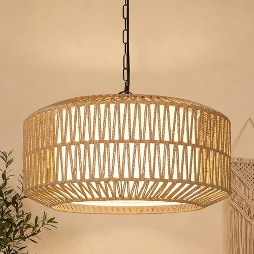
Upgraded 5-Light Farmhouse Chandelier – Two-Layer Rope Design: This hand-woven rattan light fixture combines natural rattan and durable metal for a rustic yet modern boho light fixture. The 20" diameter and 360° light diffusion create a warm, bohemian atmosphere, making it the perfect dining room light fixture or centerpiece for any room.

Elegant Farmhouse Gold Chandelier:This 3-light kitchen island chandelier combines a clean modern linear light fixture silhouette with warm farmhouse lighting appeal.The brushed brass frame and linen drum fabric shades create an elegant glow above dining tables, islands,or living rooms.

WHY CHOOSE ELYCCUPA: High-cost wicker with high quality cotton + double-sided for total four-layer dense hand weaving = no gaps, no wrinkles, and no visible frames when turn on; Beware: most of the other use low cost fabric with no or artificial cotton, and less than 4 layers hand woven to save costs, looking terrible when lit; Our brass hardware is top-grade, not cheap metal gold here. Quality worth every penny—see the difference!
6. Modern Seating Variations

A beige dining room stays modern when the seating refuses to match too neatly. I would pick three chair profiles, maybe four, and keep them all inside one warm neutral family so the room still reads as intentional.
Acrylic chairs against beige walls practically disappear; they keep sightlines open and the floor feeling larger than it is.
Molded plywood, especially in a mid-tone oak or ash, adds subtle grain that keeps beige from going flat. Upholstered seats in a slightly deeper linen or oatmeal bring softness and the only real color shift you need.
The risk is mixing all three at once without a unifying finish.
I would stop at two materials, maybe acrylic with upholstered ends, or plywood chairs with a single fabric captain’s seat. Every chair against beige competes only by shape and surface, so one of those variables needs to stay consistent.
For a weekend project on a real budget, swapping chair seats for mismatched vintage finds in matching linen covers costs less than a full set and gives you the pulled-together look without the designer markup.

Minimalist Design - Elevate your home decor with YMXYJM modern coffee table tray. Beige fluted rectangle tray with a chic scalloped edge, offering a minimalist, solid-color aesthetic. Each tray is handcrafted, exuding an elegant vibe for your home decor.
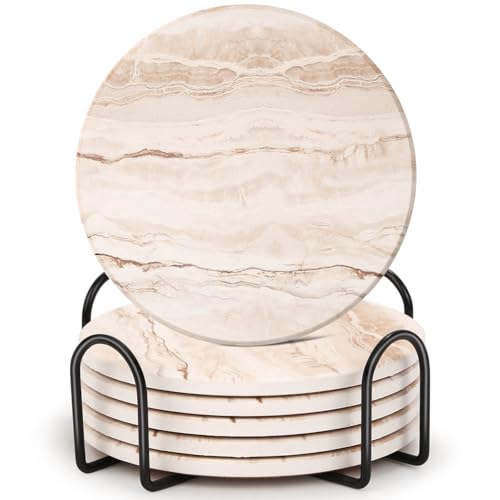
Drink Coasters Set: This drink coasters set includes 6 pieces of ceramic coasters and a metal holder. Simple marble design is suitable for home, office and party decorations. The coaster holder makes the coasters convenient for storage and make your home tidier.

➤【Luxury 7 Pieces Dining Table Set】- Complete 7 pieces dining table set consisting of 1 white imitation marble 68inch rectangular dining table and 6 velvet upholstered dining chairs which makes it perfectly sized for a dinette, kitchen, or any dining area. This marble texture top dining table with gold mirrored finish stainless steel o-shape frame will add elegance to your dining room and can easily blend in with any home decors.
7. Rustic Warmth

Reclaimed or distressed wood reads as farmhouse only when the finish stays matte and the knots show through.
I would pick a table with visible wear and pair it with forged-metal chairs that have some heft to them, not the thin wire kind.
Natural fiber comes in through a jute or sisal rug that can handle chair scrapes without looking precious.
Beige works here as a warmer alternative to white shiplap because it carries the same lightness but softens the contrast against raw wood.
White can turn a dining room into a staged set; beige lets the grain stay the focus. The variation matters: a pink-leaning beige against warm oak feels intentional, while a gray-leaning one can look muddy.
Beige can easily fit into more current decor styles like Scandinavian or modern farmhouse.
— Hunker
That flexibility is what keeps the room from dating itself. The line I would draw is at themed restaurant territory: one sign, one milk-can vase, one cow print, and the whole room tips over.
Stop at two rustic materials maximum, and let the beige wall do the rest of the work.

Accommodates 4-6 Person: With impressive dimensions of 63" W x 31.49" D x 29.53" H, this striking dining table sets the ideal stage for gatherings of 4-6 people. Possessing an inviting vibe, it fosters rich conversations and savory dining experiences. Its spacious tabletop considerately caters to plates, cutlery, serving dishes, and artistic accents with ease.

Versatile Design Dining Table (Chairs Not Included): This 47‘’ round table comfortably seats 4-6 people, perfect for family meals and entertaining guests. Its circular design encourages conversation and connection.Size:47.25"D x 47.25"W x 29.53"H

43.3-Inch Round Dining Table for 4: This 43.3-inch round dining table comfortably seats 4 for everyday meals and can fit up to 6 for casual gatherings, making it ideal for dining rooms, kitchens, apartments and breakfast nooks.
8. Industrial Beige

Concrete or metal dining furniture against warm beige walls gives you the industrial bones without the cold warehouse feel, but the pairing needs something living in it or it goes flat fast.
I would add a solid wood tabletop, even a thin one, or run linen down the center; the texture keeps beige from reading as drywall and keeps steel from reading as office park.
Wall color matters here too: a beige with a little ochre or pink in it holds its own against gray metal better than the yellow-tan shades, which just look dated beside anything modern.
Edison bulbs are the detail to skip. They have become shorthand for industrial the way chevron became shorthand for mid-century, and they throw a light so warm it fights against the coolness you actually want from concrete and steel.
A simple matte black pendant with a diffuser gives the same weight without the coffee-shop cliché.
I would spend the bulb money on a single vintage wool rug instead; the floor is where industrial beige most often reads as unfinished rather than intentional.

【100% Solid wood】:Made from 100% solid oak, this solid wood dining chair carefully selected oak material ensures that the chair is solid and durable, so you can rest assured that it will last for years to come. Size: 19.68" L x 21.65" W x 30.71" H, Seat dimension is 16.54"W x 16.54"D. Wide sitting depth design provides you with sufficient sitting space.

【5 Piece Square Dining Table Set for 4】This classic dining table features a spacious square tabletop (34.5"L x 34.5"W) and elongated tapered base legs, creating a balanced silhouette that blends power with softness for an attractive appearance. The generous surface provides ample room for place settings and serving dishes, ensuring every diner enjoys a wonderful dining experience. Its timeless design complements both modern and traditional interiors.
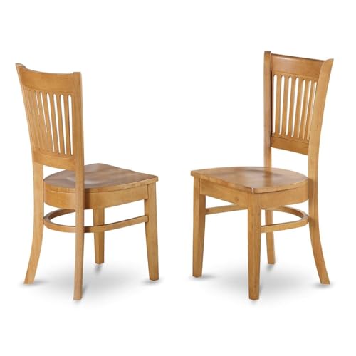
MID CENTURY DINING CHAIR SET OF 2: Infuse a versatile charm into your elegant dining table with this contemporary pair of Vancouver wooden 2 dining chairs. These mid-century dining chairs will enhance the aesthetic appeal of any living space due to their timeless design. Elevate your dining table with stylish seating that remains consistently fashionable. Enhance your family moments with this splendid kitchen chair set.
9. Beige Accent Walls

A single beige wall changes the whole room without the commitment of four. For renters, that is the practical entry point into beige dining room decor: one accent wall, the rest left as-is.
Pick the wall with the window or the wall behind the table. Never both.
Two beige walls in a dining room starts to read as a half-painted job rather than an intentional choice. The window wall draws the eye naturally and lets daylight animate the color through the day.
The wall behind the table anchors the space where people actually sit. Either works; doing both collapses the effect.
On the remaining walls, keep what you have. White reads crisp against beige, especially in a rental with standard-issue trim.
A soft gray works if the existing color is already there. The contrast does not need to be loud; it needs to be present, so the beige wall registers as a decision.
Sherwin-Williams’ Loggia, HGSW3446, is the shade I would reach for: warm enough to feel like something, neutral enough to hand back the security deposit.
It sits in that space where Scandinavian restraint meets modern farmhouse comfort, the two styles that have carried beige back from obscurity.
The ceiling stays out of it. A white ceiling keeps the room from closing in, and in a rental, you are not painting it anyway.

【SOFT UPHOLSTERED BACK FOR LONG SEATING】Designed for extended dining and everyday use, the fully upholstered padded backrest provides gentle, even support for your back. Ideal for long family dinners, holiday gatherings, or working at the dining table without feeling stiff or uncomfortable.

SIMPLE YET ELEGANT LOOK: Nailhead-trimmed upholstery, clear and clean lines make these parsons chairs a relaxed yet polished style that's just right for your home décor.

Timeless Tufted Design: Featuring classic diamond tufting with deep-set buttons, these upholstered dining room chairs present a clean and balanced silhouette. The tailored parsons-style profile adds a refined touch to dining spaces, creating a calm and welcoming atmosphere.
10. Statement Lighting
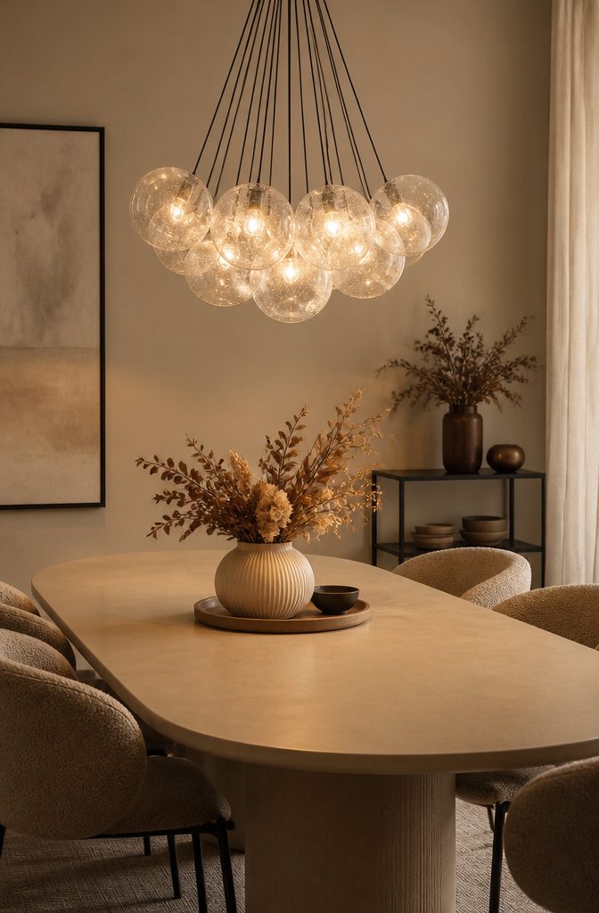
Beige walls do something white and dark walls cannot: they hold a light fixture in place visually without swallowing it or competing with it.
White lets a chandelier disappear; dark paint turns the same fixture into a harsh silhouette. Beige keeps the shape readable and the room feeling lit rather than merely illuminated.
Scale matters more than style here. A fixture about one-third the width of your table keeps the proportions right without crowding the sight lines across it.
Hang it low, roughly 30–36 inches above the surface, so the light pools where people actually sit rather than floating toward the ceiling.
For fixture types, a simple linen drum or a cluster of seeded-glass pendants reads modern against beige plaster.
A wrought-iron cage with candle-style bulbs leans rustic. Either works because the wall behind it stays quiet.
Bulb temperature is the detail that ruins the room if you ignore it.
Beige shifts easily toward pink or gray under the wrong light. Warm bulbs at 2700K keep the paint reading as the warm neutral you chose, not a muddy variant.
I would skip daylight LEDs entirely; they flatten the texture that makes beige interesting and leave the room feeling like a showroom instead of a place to eat.

Minimalist Design: The sleek cream-colored lampshade topped with a natural wood cap exudes a simple, modern aesthetic that seamlessly blends with diverse interior design styles.

【Unique Pendant Lighting】 High-density polystyrene foam lampshade, hand-molded, emphasizing smooth and retro living aesthetics. This chandelier may be the most elegant restaurant lamp you have ever seen.

5-Tier Modern Design: This pendant lighting features five layers of stacked linen shades, creating a classic design that adds depth and dimension. The natural material not only enhances the visual texture but also softens the light. Its minimalist style complements farmhouse, modern, and vintage interiors. Perfect as a kitchen island pendant light, dining room chandelier, or bedroom hanging light, it adds a touch of understated elegance to any room.
Beige Color Psychology

Beige takes fourth place among dining room color schemes at 27,120 of 273,471 rooms analyzed, and the reason is straightforward: it carries warmth without closing a space in.
Where dark colors shrink a room and pure white can read sterile, beige splits the difference.
A light beige wall reads barely darker than off-white at first glance, so the eye still travels, yet the tone keeps the room from feeling like a gallery.
I would reach for Behr Minimum Beige (HDC-MD-17) when I want that cozy minimal effect without any risk of enclosure, or Sherwin-Williams Accessible Beige (HGSW2487) if the room needs to host bolder pieces against a true neutral backdrop.
For something earthier, Behr Lentil (N270-2) brings in that grounded light, while Valspar Sand Storm (2004-10B) works when the palette needs to stay cool and collected, even against greens I might not have thought to pair it with.
The failure of beige is that it can disappear entirely if every surface matches too closely. Without contrast in texture or a darker accent somewhere, the room flattens into something forgettable rather than calm.
Natural and Artificial Light Effects

Beige shifts more dramatically under light than white or gray because it carries yellow and red undertones that either bloom or flatten depending on the source.
A north-facing dining room pulls beige toward gray and can leave it looking flat by afternoon, so I would add warm-toned bulbs at 2700 K or lower to push back that coolness.
South-facing windows warm the same paint or fabric toward peach, which works well for evening meals but can feel heavy at breakfast.
LED color temperature matters more with beige than with neutral whites because the undertones actually change the color you see, not just its brightness.
For a dining room used morning and night, I would put brighter 3000 K output on a dimmer for early use, then drop to golden low-wattage lamps after dark.
The dimmer matters more than the fixture price; a $25 pair lets one bulb do both jobs.
Furniture and Accessory Pairings
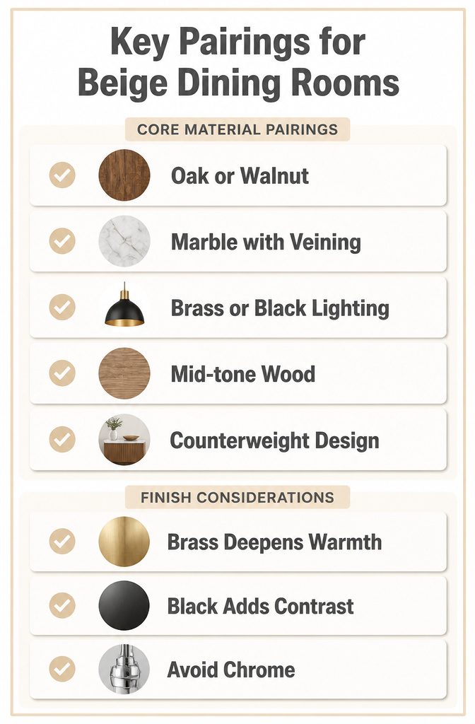
Wood, marble, and lighting are the materials that actually earn their place against beige walls.
I keep coming back to them because they each solve a problem beige creates: the color can go flat without enough texture and temperature variation in the room.
Oak or walnut with visible grain gives beige something to react against. Pale woods read as an extension of the wall and disappear; mid-tone or darker woods create the contrast that makes beige feel intentional rather than like unfinished drywall.
A walnut table against beige painted plaster looks grounded in a way a matching beige table never will.
Marble works the same way through cool veining.
The stone pulls beige back from reading too warm or too yellow, especially in rooms with limited natural light. A marble-top sideboard or even a small console behind the dining chairs introduces that counterweight without demanding a full renovation.
Lighting fixtures are where I get most selective.
Brass or black metal finishes hold up against beige where chrome falls apart. Chrome reflects cool blue from the bulb and fights the warmth that makes beige inviting; brass deepens it, and black gives the eye a clean anchor point.
A black pendant over a beige dining table reads as deliberate design, not a fixture you settled for.
The trade-off is maintenance. Brass tarnishes in ways that add character or look tired, depending on your tolerance.
Black shows dust faster than you’d expect on something meant to recede. I still pick them over chrome every time for a beige room, but I plan for the upkeep.
Frequently Asked Questions
What are some beige dining room design ideas?
Styles range from contemporary marble tables and classic wood finishes to minimal palettes built on linen, raw cotton, and unglazed ceramic.
Eclectic mixes, transitional blends, modern seating variations, rustic warmth, and industrial beige each solve a different problem: marble adds cool veining, wood brings lived-in warmth, and texture replaces color in quiet rooms.
How does lighting affect beige decor?
Beige shifts more dramatically under light than white or gray because its yellow and red undertones either bloom or flatten depending on the source.
North-facing rooms pull beige toward gray, so use bulbs at 2700 K or lower to push back; south-facing windows warm it toward peach, which suits dinner but can feel heavy at breakfast.
A dimmer matters more than fixture price, letting one bulb shift from brighter 3000 K morning light to golden low-wattage evening lamps.
Is beige a good color for a dining room?
Beige ranks fourth among dining room colors at 27,120 of 273,471 rooms analyzed, carrying warmth without closing a space in.
It splits the difference between dark colors that shrink and pure white that reads sterile, keeping the eye traveling while the tone stays inviting.
The risk is total disappearance if every surface matches too closely without texture contrast or a darker accent somewhere.
How to make a beige room pop?
Texture has to do all the work that color normally would.
Linen on windows, raw cotton on chair seats, and unglazed ceramic on the table or a pendant base each carry light differently enough that your hand notices before your eye does.
Skip high gloss or tight weaves; polished surfaces fight the mood, and slick fabrics read colder than beige intends.