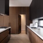

Neutral kitchen colors are paint shades that stay low in saturation so cabinets, countertops, and hardware remain the visual focus rather than competing with the walls.
The same warm beige that glows under morning sun can turn muddy under LED downlights after dark, which is why the article tests every recommendation against real rental kitchens and fixed elements like oak cabinets you cannot replace.
Sherwin-Williams Accessible Beige SW-7036 earns its place because it stays warm without drifting yellow, a balance that matters when you are painting once and living with it for years.
1. Warm Taupe

Warm taupe sits between beige and gray, and that middle ground keeps a kitchen from feeling either too sharp or too cool.
I would put it anywhere white starts to feel sterile and gray starts to feel like a cave, especially in a rental where you are painting once and living with it for a few years.
The shade pairs naturally with wood finishes, which matters when most budget kitchens already have oak or maple cabinets you cannot replace. A warm taupe wall behind them reads as intentional rather than apologetic.
Three paints get this tone right. Sherwin-Williams Accessible Beige SW-7036 stays warm under most lighting without drifting yellow, which is why designers keep reaching for it.
Benjamin Moore Natural Cream OC-14 carries a little more cream if you want softness, and Farrow & Ball Elephant’s Breath No. 229 runs more refined and gray, though you pay for the pigment concentration.
For a first-home owner painting on a Saturday, Accessible Beige wins on coverage per gallon and availability at any Sherwin-Williams store.
Warm taupe also hides the scuffs and grease that lighter neutrals broadcast within a month of cooking. That durability stretches your paint job across multiple lease terms, or until you save enough for the kitchen you actually want.
PAINT + PRIMER IN ONE: Evolve’s paint-and-primer formula helps you get great coverage from the start, sealing your surface and reducing the extra work of multiple coats.

PREMIUM WALL PAINT: Interior paint and primer in one designed to protect from everyday life

Includes 30 featured and newest released color card. Sprayed on color to see our colors in your homes lighting for more accurate color choices.
2. Soft Gray

Soft gray reads clean without ever feeling cold, which is harder to pull off than it sounds. The undertone is what separates a kitchen that feels airy from one that feels like a dental office.
Benjamin Moore Classic Gray OC-23 carries a light, airy finish that opens up a space with decent natural light. Sherwin-Williams Repose Gray SW-7015 runs warmer, leaning greige, so it handles north-facing windows or dimmer galley layouts without turning flat.
Behr Silver Drop 790C-2 sits cooler and more subdued; in a kitchen flooded with afternoon sun, that subtle coolness keeps the room from going muddy.
I would reach for Repose Gray in most real kitchens because the warmth forgives both mixed lighting and the inevitable scuffs that collect near cabinets and trim.
Classic Gray wins if you have strong southern exposure and want the walls to disappear. Silver Drop demands more: pair it with warm wood or brass, or the cool undertone can tip sterile.
Repose Gray is the safer bet for renters who paint once and need it to work for three years, not just the first month.
All three handle stainless steel and quartz without clashing, which is the baseline test for a neutral that has to live with appliances you did not pick.

Subtle semi gloss sheen creates a tough, washable finish that holds up to scrubbing in kitchens, bathrooms, doors and high traffic areas

Includes 30 featured and newest released color card. Sprayed on color to see our colors in your homes lighting for more accurate color choices.

CABINET TRANSFORMATION: Refresh outdated cabinets, vanities, furniture and trim with rich Cadet Gray color and a smooth semi-gloss finish
3. Sage Green

Sage green has earned its place among modern neutrals for the natural feel it conveys, and it works especially well in kitchens with good daylight. The muted tone keeps it grounded while offering a fresh alternative to gray.
I would pick this for a weekend project because it forgives uneven walls and reads differently as the light shifts, so you notice the change rather than fault the paint.
Three specific shades handle this balance well.
Sherwin-Williams Svelte Sage SW-6164 reads neutral yet earthy, the safest choice if you want green without committing to color. Benjamin Moore Hazy Skies OC-48 stays lighter and more understated, better for a small kitchen that needs airiness.
Sherwin-Williams Sea Salt SW-6204 carries more blue-gray; I would skip it unless your cabinets and countertops run warm, since the cool undertone can clash with honey-toned wood.
Brass hardware and open wood shelving pair naturally with any of these.
Light pine, ivory clay tones, and a few potted plants extend the palette without complication. If you want a cooler, more sophisticated scheme, swap the off-white accents for gray; for something earthier, pull in darker browns.
Either way, the sage itself stays the constant, and that is why it suits renters and first-home owners who might repaint in five years but do not want to feel stuck until then.

PAINT + PRIMER IN ONE: Evolve’s paint-and-primer formula helps you get great coverage from the start, sealing your surface and reducing the extra work of multiple coats.

Includes 30 featured and newest released color card. Sprayed on color to see our colors in your homes lighting for more accurate color choices.

TRUE ALL-IN-ONE PAINT & PRIMER – Skip the extra steps. Evolve Tru Coat combines paint and primer in one, delivering excellent adhesion and coverage on wood, metal, masonry, and concrete with minimal prep.
4. Cream
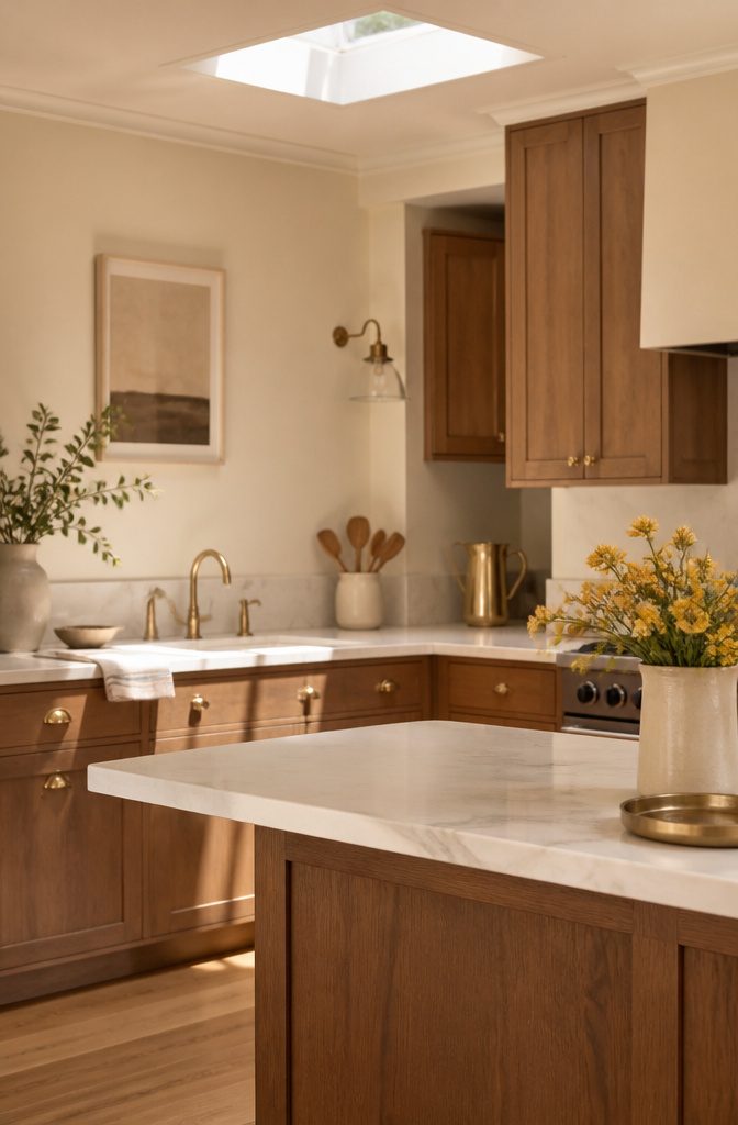
Cream lands softer than pure white without drifting into yellow territory, and in a kitchen that sees real traffic, that gentleness hides a lot.
Benjamin Moore Natural Cream OC-14 carries enough pigment to read as a color rather than a failed white, which is why it survives drips and hand smudges better than flatter alternatives.
Sherwin-Williams Snowbound SW-7004 pulls slightly cooler, a safer pick if your cabinets face north and you need to fake some daylight.
For trim and ceiling pairings, Benjamin Moore White Dove OC-17 stays the classic creamy white with enough body to avoid that stark hospital edge against either wall color.
The staying power here is practical, not just aesthetic.
Cream bounces light around a tight galley kitchen without the glare that makes evening cooking feel clinical, and when the finish inevitably dulls around the stove or sink, the shift is gradual rather than patchy.
Off-white and cream cabinets pair naturally with brass or gold hardware if you want to push toward farmhouse warmth, though I would keep the metal consistent rather than mixing pulls and knobs.
Cream can feel heavy in a low-ceiling space with poor light; Snowbound wins there, Natural Cream if you have height and windows to spare.

Extremely durable interior paint ideal for use on properly prepared interior walls, ceilings or trim composed of new or previously painted drywall, plaster, masonry, wood and metal

Easy Renovation: Our innovative bottle with a built-in brush makes your renovation projects a breeze. No need to hire professionals, as anyone can use this fast-drying, DIY-friendly product

COLORS CRAFTED BY ANNIE SLOAN: Paris Grey is a traditional and timeless grey, made from a mix of orange and blue. It provides a soft, gentle, and elegant backdrop for furniture and soft furnishings, and looks particularly great with colors with orange or blue undertones.
5. Charcoal Gray

Charcoal gray is the neutral for people who want contrast without committing to black. It reads as a color choice rather than an absence of one, and in a kitchen that distinction matters.
Lower cabinets or an island are where this shade earns its keep.
A full wall of charcoal uppers can feel like a cave, especially in a galley or a kitchen with a single window. Keep the perimeter light and let the dark tone anchor the room from below.
Three paints cover the range of undertone.
Benjamin Moore Kendall Charcoal HC-166 leans warm, almost brown in certain light. Sherwin-Williams Peppercorn SW-7674 sits cooler and quieter.
Behr Carbon Finial N520-7 pushes the darkest and most dramatic of the three. I would reach for Kendall Charcoal in a kitchen with brass hardware, where that warmth picks up the metal.
Peppercorn suits stone counters with gray veining. Carbon Finial works best in an open layout where the color has room to breathe and is not fighting tight corners.
Stone and metal finishes pair naturally with any of the three. The risk is weight: charcoal needs balance.
White or pale counters are not optional in my view; they are what keep the space from closing in. Skip charcoal entirely if your kitchen lacks natural light and you are not planning to add it artificially.

【Portable Set & Easy to Use】 We have prepared all the necessary tools for your project construction: Gloves,brush,roller,film,masking tape,sandpaper. Using our wood paint for furniture, you can fully immerse yourself in the fun of DIY. NO Sanding, NO Priming, NO Top Coat Required

Beyond paint counter top paint pint - color - bone

No Sanding Zero-Prep Formula, No Dust & No HassleSkip messy sanding, priming and topcoats with our water-based all-in-one formula. It bonds to stained or painted wood, hiding scratches with one-coat coverage, ideal for kitchen cabinets, furniture restoration and DIY upcycling for all skill levels.
6. Off-White

Bright white cabinets and walls can feel clinical in a compact kitchen, reflecting too much light and flattening every shadow until the room reads like a photocopy of itself.
Off-white keeps the space open without that glare, adding just enough warmth to let trim and hardware register as separate layers.
Benjamin Moore Chantilly Lace OC-65 stays crisp enough to feel intentional rather than dingy, while Sherwin-Williams Alabaster SW-7008 leans creamier and cozies up a north-facing space. Benjamin Moore Simply White OC-117 splits the difference, bright but still soft.
I would reach for Alabaster in a galley kitchen where natural light is scarce; in a smaller space with a window, Chantilly Lace keeps things cleaner without tipping into sterile.
Off-white asks more of your hardware finish, brass or matte black both read richer against it than against a stark white.

Includes 30 featured and newest released color card. Sprayed on color to see our colors in your homes lighting for more accurate color choices.

FULL WRAP-AROUND PRINTING – NO UNSIGHTLY WHITE EDGES: Unlike standard switch plates that leave the sides blank with raw white edges, OILbiexn features continuous wrap-around printing that covers the entire plate—front, sides, and edges The design flows seamlessly from every angle, creating a polished, finished look even on side views

FULL WRAP-AROUND PRINTING – NO UNSIGHTLY WHITE EDGES: Unlike standard switch plates that leave the sides blank with raw white edges, OILbiexn features continuous wrap-around printing that covers the entire plate—front, sides, and edges The design flows seamlessly from every angle, creating a polished, finished look even on side views
7. Oatmeal

Oatmeal lands warmer than greige without drifting into beige territory, and that middle position is why it works in kitchens that actually get used.
The shade forgives the small sins rental kitchens accumulate: uneven drywall, cabinet faces that have been repainted too many times, countertops with faint stains no cleaner removes.
Light bounces off it softly, so the room reads bright at 7 a.m. and settled by evening.
Three paints carry this tone with the right undertones. Benjamin Moore Revere Pewter sits at the cooler edge, a greige that shifts with daylight without turning muddy.
Sherwin-Williams Dumpling runs creamier, the choice if your cabinets or tile lean warm already. Sherwin-Williams Shiitake deepens the mix for lower walls or a pantry where you want shadow without closing the space in.
Leigh of River Brook Design & Construction, who has built kitchens in both Revere Pewter and Dumpling, calls Revere Pewter a timeless tone with enough warmth to feel inviting and enough depth to keep it from reading flat.
Not all oatmeal shades are made equal. You want to pick a paint with the right undertones so it’s timeless, without leaning too trend-led.
That means testing a swatch on the wall you face while washing dishes, not the one that gets morning sun.
The wrong undertone turns oatmeal peach or green under your specific light, and a gallon of correction costs the same as the first.


1. Grey Gold Abstract Wall Art Size: 16x24inch(40x60cm),Frameless Posters, perfect gift for friends and family.

All-in-One Formula: This furniture paint includes a built-in primer and top coat, providing seamless application on wood, metal, laminate, and more surfaces for a hassle-free painting experience.
8. Greige

Greige sits right where warm and cool meet, and that is exactly why it works for a kitchen you will not want to repaint in three years.
The color borrows the quiet of gray and the welcome of beige, so it neither chills a north-facing room nor turns yellow in afternoon sun.
Agreeable Gray by Sherwin-Williams is the shade I would test first if your cabinets run maple or oak and you need something that reads neutral without fighting the wood.
For walls in a kitchen with marble counters and brass hardware, Benjamin Moore Classic Gray plays cleaner, almost airy, while still holding enough depth to avoid looking like primer.
Revere Pewter, also from Benjamin Moore, carries more body; it shifts warmer as the day fades, which makes it the pick if you want the space to feel wrapped in rather than simply painted.
Greige can look muddy under fluorescent bulbs, so swap to 2700K LEDs before you commit.

Includes Three Shades to Match 90% of Surfaces: We offer two color shades of Matte Beige and one Matte White to instantly achieve the perfect color match. Eliminating the need for color charts, returns, and waiting for the right color to arrive. Instead, match to one of the two beige colors or mix colors and match to your desired shade.

CONVENIENT SIZE & BRIGHT COLORS - This versatile acrylic paint comes in 2 oz bottles - great for projects big and small!

This product is Non-toxic
9. Light Blue

Light blue sits at the edge of what most people call neutral, but Benjamin Moore’s Beach Glass earns its place in a kitchen that gets enough sun.
The color carries a quiet green undertone, the kind that reads as weathered seaglass rather than nursery blue, and that subtle shift keeps it from feeling like you borrowed a bathroom palette.
I would only paint it in a kitchen with generous natural light and some openness to the next room. In a tight galley or a space that relies on fixtures alone, the blue turns flat and cold.
Pair it with white cabinetry and stainless appliances if you want the crisp, coastal read; otherwise the color competes with warm woods and looks muddy.
The risk is real. Beach Glass needs the light to activate its depth, and without it you have a wall color that feels like a mistake.
For a weekend project on a real budget, this is the choice for the kitchen with big windows and an already airy feel. Everywhere else, I would skip it and stay with a warmer neutral that forgives shadow.

*Prestige Paints has created a comparable color based on color specifications of the original color using industry leading technology.

WATER-BASED & LOW ODOR Water-Based Interior Paint – Low-odor formula designed for everyday indoor painting and refresh projects. Creates a comfortable application experience while providing a clean matte finish for interior walls and ceilings.
Exceptional Coverage & Lasting Durability: Achieve vibrant, rich color with fewer coats. Our durable finish withstands everyday wear and tear, making it ideal for busy households and frequently used furniture pieces indoors and outdoors.
10. Black
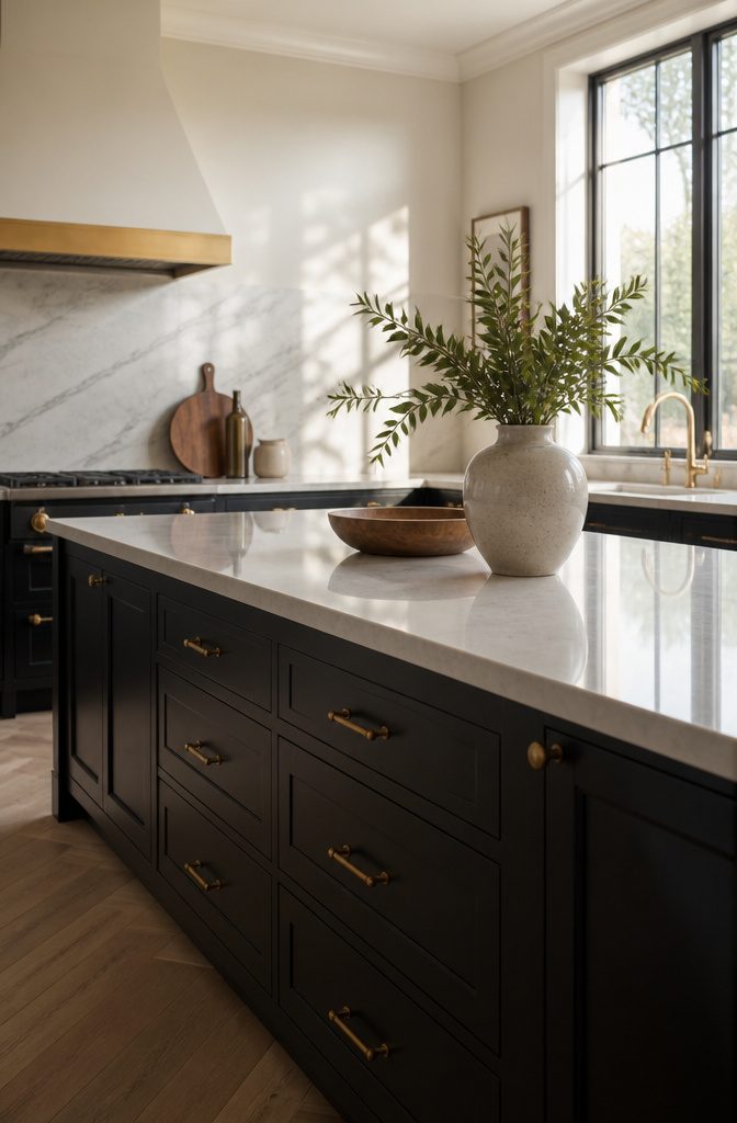
Black works in a neutral kitchen when you treat it as a punctuation mark, not a paragraph.
I keep it to lower cabinets or a single island, letting lighter walls and countertops carry the room’s weight. In a small kitchen, that placement keeps the eye moving upward and prevents the space from feeling like a cave.
Renters can get the same effect with removable contact paper on cabinet fronts or a peel-and-stick backsplash behind the range, both lifted without a security deposit fight.
The ceiling and at least two walls should stay light if you want contrast without claustrophobia.
Brass hardware against black reads sharp and contemporary, though I would skip it if the rest of your finishes lean warm and rustic, it fights the tone.
Stone or metal finishes ground the look, but the real win is control: black lets you add drama and still strip it back to landlord-friendly when the lease ends.

1. [Ultimate Furniture Paint for Professional Results] Revitalize your home with our premium furniture paint, designed to deliver a smooth, factory-like finish. This high-performance cabinet paint is perfect for kitchen renovations, bathroom vanities, and old dressers. Whether you are a pro or a beginner, achieving a flawless look has never been easier.

No Sanding Zero-Prep Formula, No Dust & No HassleSkip messy sanding, priming and topcoats with our water-based all-in-one formula. It bonds to stained or painted wood, hiding scratches with one-coat coverage, ideal for kitchen cabinets, furniture restoration and DIY upcycling for all skill levels.

No Sanding Zero-Prep Formula, No Dust & No HassleSkip messy sanding, priming and topcoats with our water-based all-in-one formula. It bonds to stained or painted wood, hiding scratches with one-coat coverage, ideal for kitchen cabinets, furniture restoration and DIY upcycling for all skill levels.
Testing Colors in Your Space
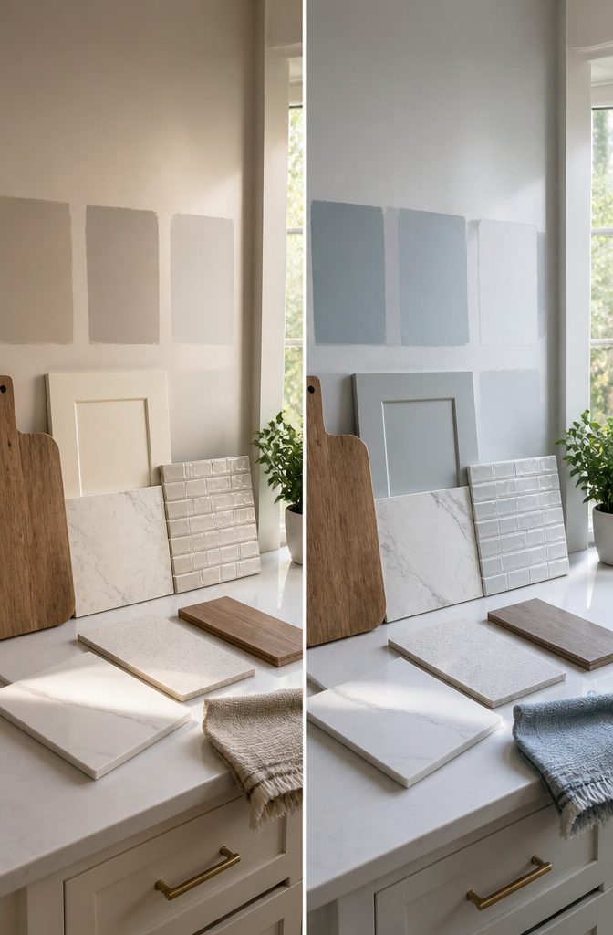
The same warm beige that glows under morning sun can turn muddy under LED downlights after dark.
I always test samples on multiple walls and check them at three points in the day: morning light, overhead noon light, and evening with fixtures on. Paint a two-foot square minimum, not a chip the size of a business card.
Undertones reveal themselves only at scale. A gray that reads clean at 10 a.m. may show green or violet when the sun shifts west.
Your fixed elements decide what works. Countertops, flooring, and backsplash tile carry undertones that will either harmonize with your neutral or fight it.
Hold the sample against each material separately, then step back and view the whole palette together. If the cabinet sample clashes with the floor, the wall color will not save it.
For kitchens with abundant natural light, moodier neutrals like deeper greige or taupe hold their character without going flat.
In darker kitchens, brighter neutrals such as creamy white or soft oatmeal reflect what light exists rather than absorbing it. Coherence matters more than contrast for its own sake.
Pairing Neutrals With Wood Stone and Metal

Wood brings warmth that keeps a neutral kitchen from feeling sterile, and the right pairing does not require a full renovation.
A white oak cutting board leaned against a soft gray backsplash, or a walnut shelf mounted on a greige wall, adds depth for under $60 and takes an hour to install.
Stone works on the same principle. A honed limestone trivor or travertine coaster set on a cream counter reads as intentional, not accidental, because the matte finish absorbs light instead of competing with it.
Metal is where I get picky. Brushed brass against warm taupe feels considered; polished chrome against the same shade feels cold.
For renters, swap cabinet hardware before you touch the walls. A dozen brass pulls cost roughly $80–$120 and change the room’s tone in an afternoon.
Matte black iron handles read better against oatmeal or off-white than stainless ever does. The limit is cohesion, not variety.
One wood tone, one metal finish, one stone surface. More than that, and the calm you came for dissolves into clutter.
Why Neutrals Stay Relevant

Beige kitchen cabinets, white-and-wood combos, and soft gray cabinetry all stay popular year after year for the same reason: they shift with you.
A neutral base lets you swap hardware, lighting, or a backsplash without starting over, which matters when you are working with a few hundred dollars and a single weekend.
I have watched friends paint walls three times in five years while their cream cabinets sat unchanged.
That is the practical side. Neutrals also read as calm because they stay desaturated; pale gray, warm taupe, and natural wood create a quiet backdrop where cabinet profiles and countertops become the detail instead of competing with it.
The risk is choosing a tone that fights your light. Beige turns muddy in a north-facing room.
Soft gray can read sterile without wood or brass to warm it. My own pick for a rental or first home is greige, the gray-beige mix, because it handles both warm and cool daylight without committing to either.
It can feel safe, even bland, if you do not layer in texture through counters or open shelving.
If you want a kitchen that still looks right in 2030, start with the cabinet color that forgives trends. Paint the walls later.
Frequently Asked Questions
What is the best neutral color for a kitchen?
The best neutral color depends on your space and lighting. Greige, warm taupe, and soft gray all work well in most kitchens, while cream and oatmeal suit darker rooms that need to bounce light around.
Test a two-foot square sample on multiple walls and check it at morning, noon, and evening before you commit.
How do you style a neutral kitchen?
Layer one wood tone, one metal finish, and one stone surface to keep the calm from dissolving into clutter.
A white oak cutting board against a soft gray backsplash or a dozen brass pulls swapped in for $80–$120 adds depth in an afternoon. Skip variety for variety’s sake; cohesion is what makes a neutral kitchen feel intentional.
What kitchen colors never go out of style?
Beige kitchen cabinets, white-and-wood combos, and soft gray cabinetry stay popular year after year because they shift with you.
A neutral base lets you swap hardware, lighting, or a backsplash without starting over, which matters when you are working with a few hundred dollars and a single weekend.
What color is replacing beige in 2026?
Greige, the gray-beige mix, has taken the place of pure beige in most new kitchens because it neither chills a north-facing room nor turns yellow in afternoon sun.
Warm taupe and oatmeal also fill the same warm-neutral role with more depth and less trend risk than the beiges of past decades.
What are the top 5 neutral colors?
The five most versatile neutral kitchen colors are greige, warm taupe, soft gray, cream, and off-white.
Greige and warm taupe handle mixed lighting best, soft gray opens up spaces with decent natural light, cream hides scuffs and hand smudges in high-traffic kitchens, and off-white keeps compact kitchens open without the glare of pure white.
What is Joanna Gaines’ favorite kitchen color?
For a similar warm, farmhouse-friendly palette, cream with brass or gold hardware pushes toward the warmth her designs often feature, while Alabaster SW-7008 or Natural Cream OC-14 provide the creamy, lived-in base that style demands.