
The difference between sage and olive in a beige and green kitchen is not taste; it is the light your room actually gets.
North-facing windows flatten sage to chalk by afternoon, while olive turns mustard in bright east light. A 12-by-12-inch swatch lived with for two days will settle it, not a 2-inch chip at the paint store.
1. Sage Green Cabinets

Sage green reads as color without reading as statement, which is exactly what makes it the safest entry point into a beige and green kitchen.
The shade sits lighter and slightly grayer than forest green, so it behaves like a neutral that happens to be green.
That muting matters when you are renting or working with a kitchen you did not design from the studs up: your countertop options stay open, your beige backsplash does not fight for attention, and the whole room still feels intentional.
I would start here if I were nervous about color commitment. Sage pairs with warm beige without turning muddy, and it handles cool beige without looking sickly.
The same cabinets can move with you from a 1920s rental with original trim to a new build with generic finishes, which is not something I would say about forest green or even olive.
Those shades demand the right light and the right architecture. Sage just asks for a wall to hang on.
In a small or dark kitchen, pale sage against cream or beige opens the space rather than closing it in.
The airiness comes from the gray undertone doing the visual work of a neutral while the green registers just enough to keep the room from feeling like another beige box.
For a weekend project with a few hundred dollars and a brush, this is where it pays off: enough character to notice, enough restraint to live with.

Includes 30 featured and newest released color card. Sprayed on color to see our colors in your homes lighting for more accurate color choices.

Includes 30 featured and newest released color card. Sprayed on color to see our colors in your homes lighting for more accurate color choices.
2. Olive Green Cabinets

Olive green reads as a commitment, not a dabble. Against beige walls or stone countertops, it sits deep and saturated where sage would whisper, and that intensity needs room to breathe.
I would put it in a larger kitchen with enough wall space that the cabinets do not crowd each other, and I would want south- or west-facing windows to keep the color from flattening into murk by noon.
In a small galley layout or a north-facing room, the same shade turns heavy fast; the beige around it starts looking like a dim basement rather than a warm frame.
Stainless hardware and a light stone countertop help, but they do not fix a light deficit.
If your kitchen is compact or your daylight is thin, this is the tone I would skip in favor of something lighter in the same family.

Belong To Your kitchen: The kitchen cabinet features 2 large door cabinets and 2 full extension drawers great for storing coffee beans, seasoner, spare kitchen paper, or some sundries. Meanwhile, your coffee maker, toaster, can sit on our wide tabletop
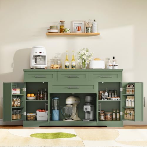
Large Storage Space: With upgraded drawers, spacious cabinets, and open shelves, this kitchen sideboard provides maximized storage capacity for all your essentials — from dinnerware and pantry items to small appliances like rice cookers. Say goodbye to cluttered countertops and enjoy a clean, organized kitchen with everything neatly in place

【WATER BASED & LOW ODOR】DWIL Cabinet Paint features a water-based, low-odor formula for a more comfortable indoor painting experience. It is ideal for updating kitchen cabinets, bathroom vanities, and wood furniture without the strong odor commonly associated with oil-based paint.
3. Two-Tone Cabinets

Green uppers with beige lowers is the two-tone combination that anchors a beige and green kitchen without letting the darker color swallow the room.
Ceilings read lighter than floors, so the eye already expects weight below; flipping the scheme puts a shadow band across the top that can feel like a lowered ceiling even in good daylight.
Beige on the bottom also hides the scuffs and water spots that collect at the sink and kick plates, while green at eye level gives you the color where you actually look.
I would keep the uppers in a muted sage with enough gray to read as neutral, and run the beige lowers in a warm greige that picks up the same undertone so the two cabinets do not quarrel.
The break line matters. I would align it with the bottom of a standard upper cabinet, about 30 inches off the counter, and run a simple shaker rail in whichever color is cheaper to touch up later.
A two-tone job costs roughly the same as a single color if you are painting existing boxes, but ordering new doors in two finishes can add 15–20 percent to the cabinet line; for a weekend budget, paint is the move.
One risk: if your uppers run to the ceiling, the green can feel like a heavy stripe.
I would stop the color 12 inches short and let the crown stay beige, or skip crown entirely and let the wall finish the job.

Ample Storage Space: The buffet cabinet offers an efficient storage solution with wide tabletop, a handy drawer, bottom large cabinet as well as two side doors each with three storage shelvings, which keeps your kitchen well organized while bringing some style

Assembly Takes Time, But It's Worth It: The coffee bar cabinet might take some time due to the many parts involved. However, don’t worry! We provide clear, step-by-step assembly instructions complete with pictures and a total of 35 labeled pieces to make the process easier. We promise that once you’re done, you’ll be thrilled with the results

Ready-Made: This set includes 2 linen-blend tie-top curtains, each measuring 26"W x 36"L, for a total coverage of 52"W x 36"L. The 3-inch top tabs are included in the length and easily slide onto rods up to 1.5" in diameter, making installation a breeze
4. Beige Countertops
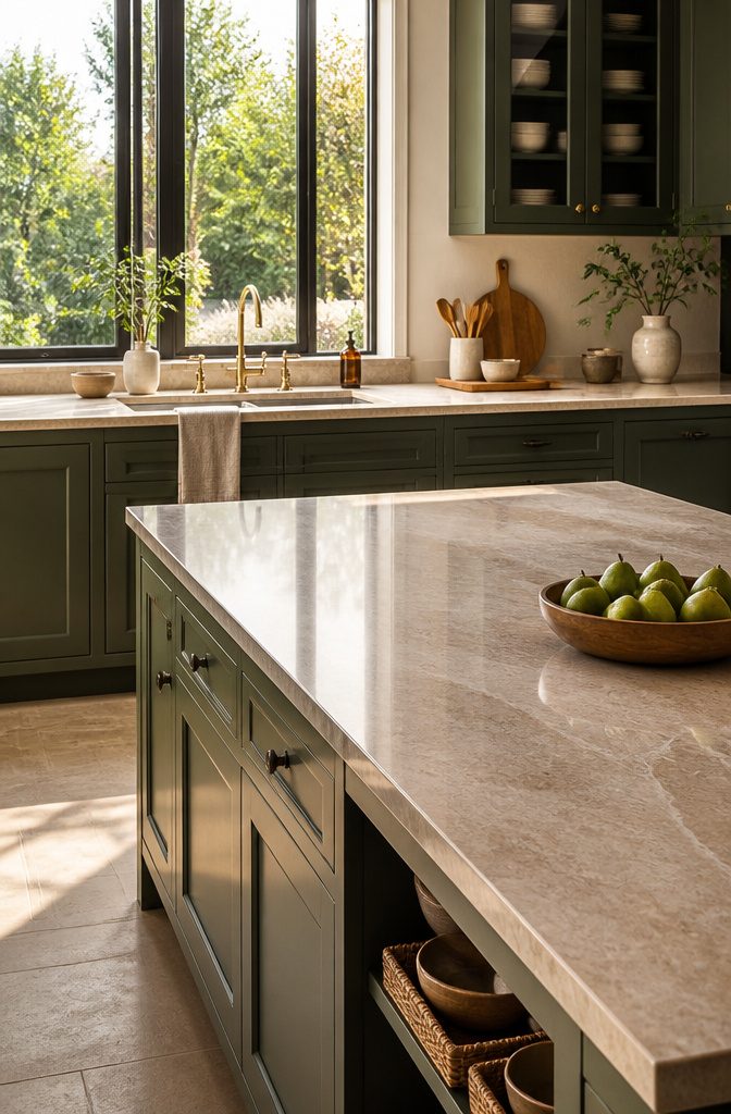
Light beige stone countertops give green cabinetry the breathing room it needs. The contrast stays soft, not sharp, which is why the pairing keeps showing up in kitchens that actually get lived in.
Quartz wins for a weekend install because it arrives finished, needs no sealing, and tolerates a rental’s wear without drama.
Natural stone, warm and irregular in the right way, only makes sense if you are already tearing out the old deck and can live with the maintenance.
I would put quartz in any kitchen I needed to use on Monday, and save the beige travertine or limestone for a full renovation where the timeline stretches past a single weekend.
The stone gives you variation that quartz mimics; the quartz gives you a surface you can set a hot pan on without keeping a spreadsheet of sealant dates.
For a few hundred dollars and a Saturday, that trade is easy to call.

Size and Material: 17.3 inch(W) ×197inch (L) , with an area of 23.6 square feet. The green peel and stick wall paper is made of vinyl material with waterproof film

Enhanced Adhesive Strength: Our peel and stick tile improved backing glue ensures a firm grip on smooth and lightly textured surfaces for a lasting upgrade.
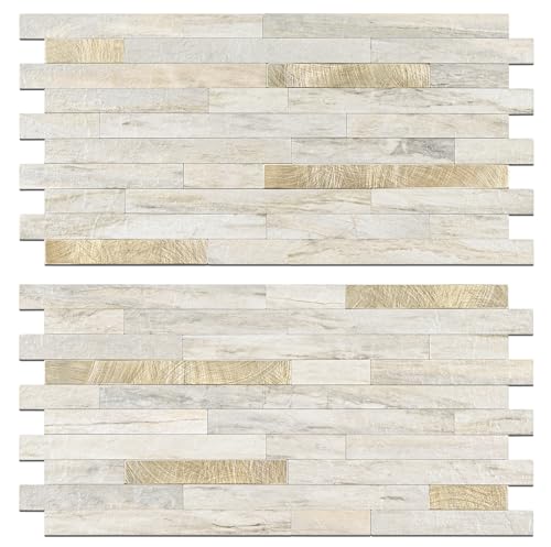
Enhanced Adhesive Strength: Our peel and stick tile improved backing glue ensures a firm grip on smooth and lightly textured surfaces for a lasting upgrade.
5. Wood Accents

Wood is what keeps a beige and green kitchen from feeling like a paint sample board. The right tone depends on which green you are working with.
Sage pairs with lighter, cooler woods: white oak, ash, or a pale birch. Olive needs more warmth, so I would reach for teak or mahogany to keep the palette from going flat.
A full cabinet rebuild is not required to bring this in. Open shelving on one wall gives you the texture without the cost or commitment.
Bar stools with solid wood seats, a thick cutting board leaned against the backsplash, or even a wooden-look laminate on the floor if you are ready for that step.
Skip painted wood; olive over wood misses the point when the green already lives on your cabinets. Let the grain show.
The farmhouse kitchens that pull this off keep the wood honest and slightly worn, not rustic as a performance. One shelf, two stools, a board you actually use: that is enough warmth to make the room feel lived in.

PREMIUM QUALITY: Crafted from 100% cotton, these towels provide a soft, plush feel while ensuring maximum absorbency for everyday use in the kitchen or bathroom. Made with safe, OEKO-TEX certified materials only.

Premium Materials: This embroidery textured table runner is made of high quality cotton linen fabric, easy to clean, stain resistant. Embroidery simple pattern which gives it a warm, earthy and elegant look.
Premium Materials: This embroidery textured table runner is made of high quality cotton linen fabric, easy to clean, stain resistant. Embroidery simple pattern which gives it a warm, earthy and elegant look.
6. Botanical Elements

A living plant does something no painted cabinet can: it shifts the green in your kitchen from a color choice to an atmosphere.
The question is where that atmosphere matters enough to water something, and where a good fake keeps the look without the upkeep.
Real plants belong on open shelving near a window, where morning light and the humidity from a boiling pot mimic the conditions a spider plant or string of hearts actually wants.
Succulents work too, but only if that shelf gets direct sun; otherwise they stretch and pale within a month.
I would skip the windowsill above the sink unless you are committed to wiping leaves weekly, since grease settles there faster than you notice.
For the center of an island or a dining table, dried flowers get you the botanical shape without the light gamble.
A fresh bouquet every two weeks is the other option, but most people overestimate how often they will swap water.
The fake stems sold for kitchen use now have enough variation in leaf tone to read as real at conversation distance, which is all the table demands.
The difference is tactile: a real plant softens the room in a way you feel when you walk in, while a fake one only photographs well.
For a kitchen you actually cook in, I would put the living thing where I see it making coffee, and the dried or fake arrangement where guests gather.

ALL-IN-1 PAINT & PRIMER: A hardy multi-purpose and multi-surface one-coat paint and primer in one for almost any indoor or outdoor surface. A wall, ceiling, floor, skirting board, cabinet, furniture and door paint for your bathroom, kitchen, home and garden.

All-in-One Formula: This furniture paint includes a built-in primer and top coat, providing seamless application on wood, metal, laminate, and more surfaces for a hassle-free painting experience.

Includes 30 featured and newest released color card. Sprayed on color to see our colors in your homes lighting for more accurate color choices.
7. Stylish Hardware
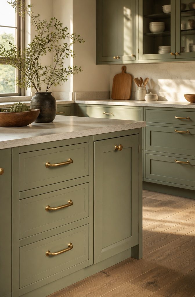
Chrome hardware reads cool against sage green, which can leave the whole kitchen feeling flat if the cabinets already lean gray.
Brass warms the palette up, and matte brass in particular has the soft glow that olive needs without the glare that polished chrome brings.
I would put matte brass with olive and satin chrome with sage if I had to choose, though the gap between them has narrowed.
The designers I follow have moved almost entirely to matte brass for either green, partly because the brushed surface hides water spots from hands that are usually in the middle of cooking, and partly because the muted finish echoes the muted paint.
Polished chrome still works if your beige runs pink or yellow, but for the dusty, grayed beiges that pair with these greens, matte brass ties the room together in a way that chrome interrupts.

Velvet Necklace Folder-It fits pearl necklace,ring,hoop earrings or chain bracelet

VERSATILE STORAGE: This sideboard buffet cabinet provides versatile storage space with 2 drawers, 3 doors to neatly organize your dishes, books, photos or decor items. The shelf inside is 3-level adjustable to meet various storage needs.

【WATER BASED & LOW ODOR】DWIL Cabinet Paint features a water-based, low-odor formula for a more comfortable indoor painting experience. It is ideal for refreshing kitchen cabinets, bathroom vanities, and wood furniture without the strong odor commonly associated with oil-based paint.
Sage vs. Olive: How the Light Decides
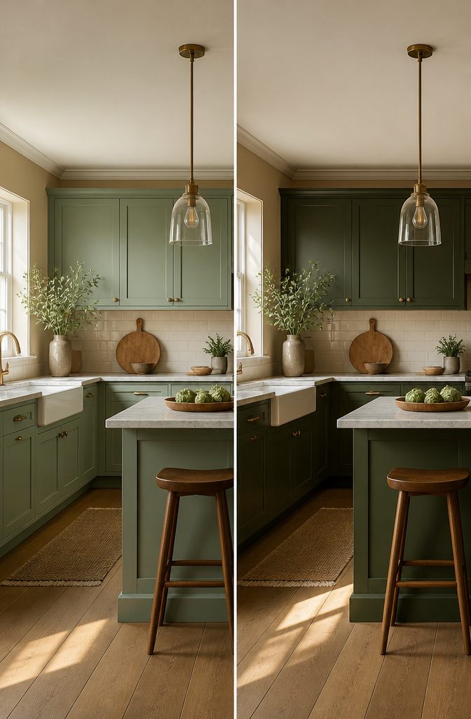
Morning light pulls sage toward gray-blue, and that shift can turn a cabinet color you loved at 10 a.m. into something you tolerate by dinner.
East-facing kitchens get that cool, clear sunrise for a few hours, then settle into neutral daylight; sage reads as a soft, true green there, almost botanical.
North-facing rooms never get direct sun, so the same sage can look flat and chalky by afternoon, more like a pale hospital wall than a garden tone.
Olive, with its yellow undertone, fights back better in dim light. It stays warm and dimensional where sage goes cold, though in a bright east room it can turn almost mustard by late morning.
I would test a 12×12 inch swatch, minimum, on the wall that gets the least light and live with it for two full days.
Paint stores push 2×2 chips, but at that size the beige trim next to it changes how your eye reads the green.
What reads balanced at 9 a.m. may look muddy by 5 p.m., and in a kitchen you see at both hours, that matters more than the perfect noon snapshot.

【Higher Weight Capacity UP TO 302 Ibs】An Special Adjustable Support Leg is directly under the center of the sideboard buffet cabinet with storage. The fifth leg can stably support the buffet, largely avoiding the shelves from bending and shaking! So our countertop and each shelf can support up to 302Ibs, 68Ibs separately!

Exquisite Carvings The vintage carvings on the pantry doors are a perfect blend of art and elegance. The hollowed out design not only provides a sense of sophistication, but also allows light to pass through the cabinet doors, creating a beautiful light effect. No matter where it is placed in your home, it is the center of vision

AMPLE STORAGE SPACE FOR EVERY ROOM Designed as a versatile storage cabinet, this buffet cabinet features spacious compartments and shelves to organize kitchen essentials, dinnerware, coffee supplies, books, and home decorations. Keep your space clean and organized with practical storage solutions.
Why Muted Green Hides Wear Better Than White

Muted green cabinets carry a practical edge that white simply does not.
The same scuff that reads as a glaring mark on white paint sinks into sage or olive and disappears, because the color already lives in the middle range of light and shadow.
Fingerprints near pulls, the slight clouding that builds along door edges, the dust that settles on the frame above the range: all of it stays visible longer on white and demands more frequent wiping to keep the kitchen looking kept.
For a first-home owner working weekends and trying to keep costs down, this matters more than the showroom photo suggests.
A kitchen that looks acceptable on Wednesday evening without a full wipe-down saves time and preserves the finish, since every scrubbing wears the topcoat slightly.
I would put muted green on the base cabinets especially, where the traffic concentrates, and use white or beige up top if the contrast appeals. The lower cabinets take the hits; the uppers mostly catch light.

Premium Backsplash Tiles: Includes 10 peel and stick backsplash tile sheets, each 12 x 12 inches, covering about 10 sq ft before trimming. The beige green mosaic checkerboard design adds a classic yet modern look to kitchen and bathroom walls

Peel and Stick Backsplash Tiles: Create a stylish and modern look in your kitchen with the peel and stick backsplash. These 10 sheet peel and stick backsplash tiles provide a larger coverage area, with each self-adhesive tile measuring 12 x 12 inches

PREMIUM PEEL AND STICK TILES MADE IN NORTH AMERICA : Buy local from the market leader in self-adhesive wall tiles. At Smart Tiles, we offer a large selection of easy to install, high quality backsplash tile designs. Each pack of 5 tiles covers 2.03 Sq. Ft.
Stone, Quartz, or Laminate: Countertop Materials Compared
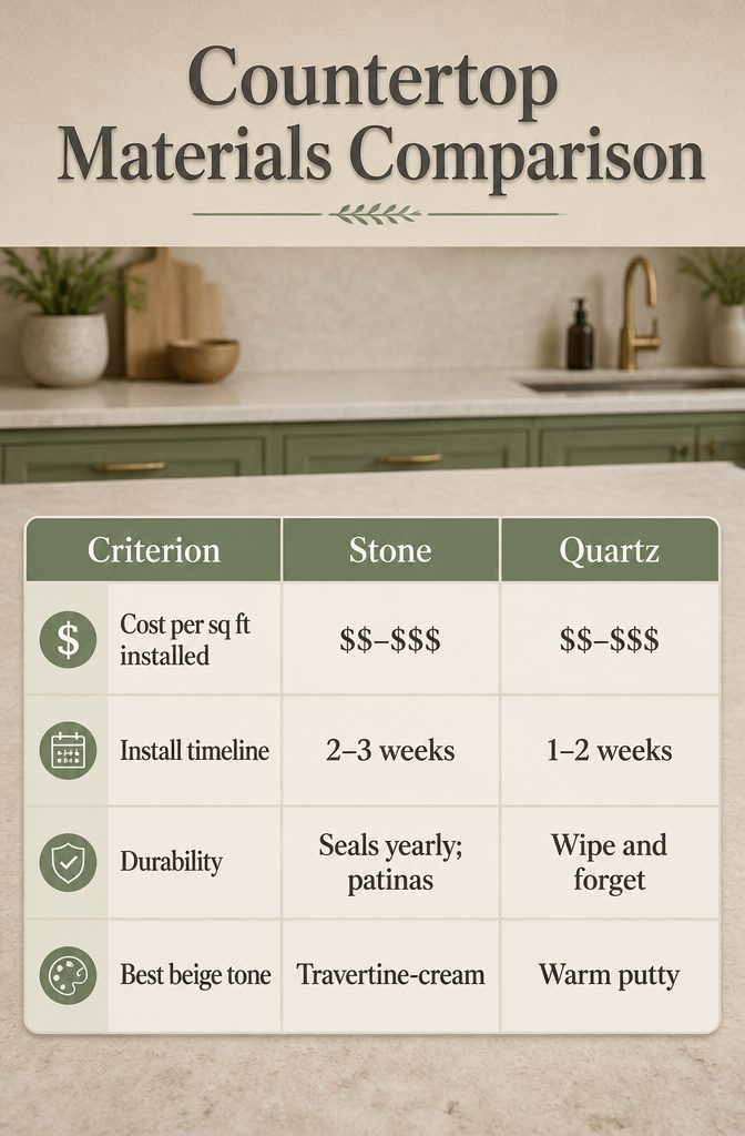
Stone carries warmth that quartz struggles to match, but that warmth comes at a price in both money and maintenance.
Laminate has closed the gap on looks, especially in beige tones that hide the printed seam line where stone patterns used to fail.
| Stone | Quartz | Laminate | |
|---|---|---|---|
| Cost per sq ft installed | $$–$$$ | $$–$$$ | $ |
| Install timeline | 2–3 weeks | 1–2 weeks | 3–5 days |
| Durability | Seals yearly; patinas | Wipe and forget | 10–15 years, then replace |
| Best beige tone | Travertine-cream | Warm putty | Greige matte |
At $400, I would pick laminate in a warm greige and put the savings toward a better faucet or hardware. The beige-and-green palette already leans natural; a matte laminate in the right tone reads intentional rather than cheap.
At $1,000, quartz wins for me. The maintenance gap matters on a weekend timeline, and quartz’s warm putty tones pair cleanly with sage or olive without fighting the cabinets for attention.
Stone only makes sense here if you genuinely want the patina and do not mind the yearly sealing; I would skip it for a first project.
Premium Materials: This embroidery textured table runner is made of high quality cotton linen fabric, easy to clean, stain resistant. Embroidery simple pattern which gives it a warm, earthy and elegant look
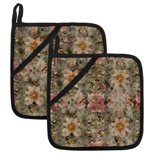
2-In-1 Versatile Design: Features two spacious glove pockets, allowing you to use it as a traditional oven mitt for safe handling of hot bakeware, or simply lay it flat as a hot pad or trivet for pots, pans, and dishes.

2-In-1 Versatile Design: Features two spacious glove pockets, allowing you to use it as a traditional oven mitt for safe handling of hot bakeware, or simply lay it flat as a hot pad or trivet for pots, pans, and dishes.
What I Would Skip in This Palette

A few things will quietly undo a beige and green kitchen before you notice what went wrong.
- Cool gray floors read as the wrong temperature. Beige is warm by nature, and gray with a blue undertone parks itself in a different color family entirely. The two do not negotiate; they just sit there arguing.
- Black appliances drop too heavy a shape into a palette that wants softness. Stainless or white lets the green cabinetry stay the visual lead.
- Overly saturated emerald fights the muted quality that makes this combination work. Sage and olive succeed because they carry gray and brown; a bright jewel green looks like it wandered in from another room.
- High-gloss finishes on both colors at once. One sheen level needs to stay relaxed, or the space turns theatrical.
I would rather see a floor with honey-toned wood or a stone that picks up the cabinet warmth than chase contrast for its own sake.
Frequently Asked Questions
What shades of green work best for a kitchen?
Sage and olive green are the two shades that pair best with beige. Sage reads lighter and grayer, behaving almost like a neutral that happens to be green, which makes it the safest starting point.
Olive sits deeper and more saturated, needing larger spaces with strong south- or west-facing light to avoid turning murky.
How can I balance the colors in a beige and green kitchen?
Put green on the upper cabinets and beige on the lowers. Ceilings read lighter than floors, so the eye already expects weight below; flipping the scheme creates a shadow band that feels like a lowered ceiling.
Align the break at about 30 inches off the counter, and stop green 12 inches short of the ceiling if uppers run to the top.
What materials should I use for countertops?
Light beige quartz wins for most projects because it arrives finished, needs no sealing, and tolerates daily wear.
Natural stone like travertine or limestone carries more warmth but only makes sense if you can live with yearly maintenance and a longer timeline.
At roughly $400, laminate in a warm greige is the budget move; at $1,000, quartz becomes the better value.
What color kitchen is on trend in 2026?
Sage green kitchens are trending in 2026 for their soft, calming feel that still stands apart from basic neutrals.
The muted shade brings natural character without demanding a full renovation, and it pairs cleanly with the warm beiges and wood tones that are also holding strong.
What colors complement a beige kitchen?
Muted greens, particularly sage and olive, complement beige by picking up its warm undertones rather than fighting them.
Wood accents in white oak or ash for sage, teak or mahogany for olive, add texture. Chrome or matte brass hardware ties the palette together depending on whether the beige leans cool or warm.
What color complements a green kitchen?
Beige is the natural complement, with warm greige tones bridging sage and olive alike.
The pairing works because both colors live in the muted middle range rather than at full saturation. Stainless steel or white appliances keep the palette soft, while brass hardware warms up olive and satin chrome suits sage.
What are some trendy green kitchen ideas for 2026?
Two-tone cabinets with green uppers and beige lowers are trending, along with sage green used on built-in cabinetry for a calm, integrated look.
Botanical elements, whether real plants on open shelving near windows or dried arrangements for low-light spots, shift green from a color choice to an atmosphere.
Matte brass hardware has largely replaced chrome for its soft glow and practical hiding of water spots.